Greetings friends, it’s January, always a good time for a little reflection. Though painting is not the only thing going on in my life, nor the most important, it’s one of the areas I can count.
I’m happy to report that in 2023, 110 paintings went out the door. Most were sold, some were gifts. I’m always grateful for both.
As for the revenue, I’ll just say I’m satisfied. Even blessed.
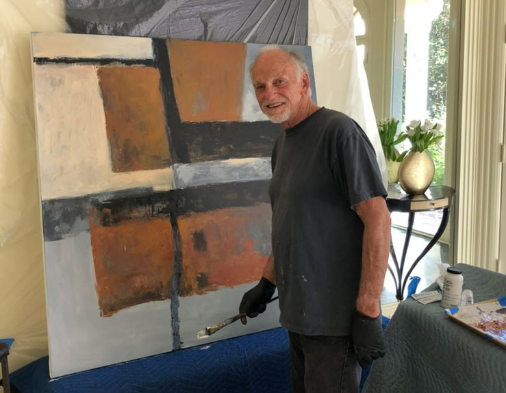
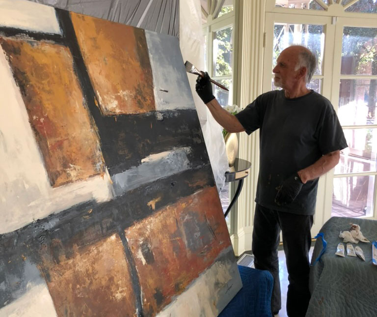
Regarding production, I made 99 paintings, large and small (none very small, and some very large). That averages out to over eight per month, almost two per week.
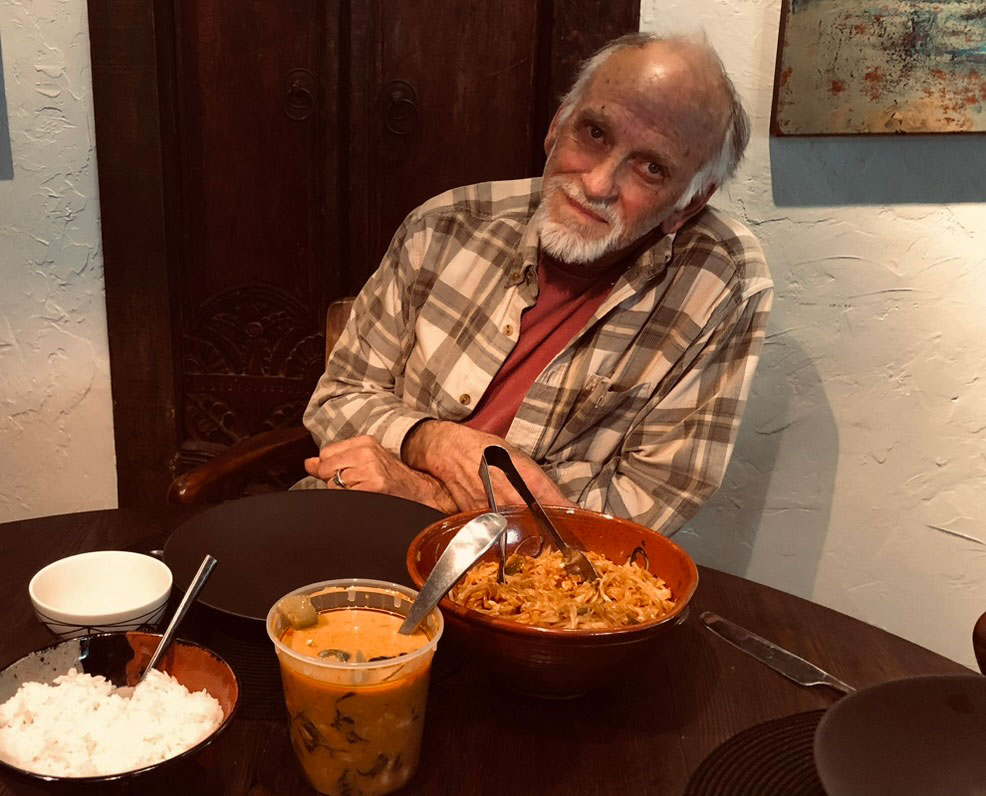
Actually I thought I was more productive than that, but A-Fib had me dead on the couch the whole month of June! I couldn’t even lift a brush, and the studio was a distant planet.
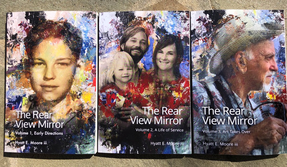
This year I also completed my three-part memoir, “The Rear View Mirror.” Though I keep thinking of other things I could have added, I’m satisfied I’ve said everything important I wanted to relate (and some unimportant). People reading them say they’re good.
In September I entered my 80th year! Though I plan on many more, it doesn’t take binoculars to see a horizon from here. The goals I’m setting for myself now are more, shall we say, metaphysical.
But I expect to keep painting, probably as much, with aims for always better.
I’m grateful for friends, like you, reading this. I’m always glad to hear back from you.
Enjoy the review. You might want to get a coffee. But, hey, it’s been a full year.
.
JANUARY
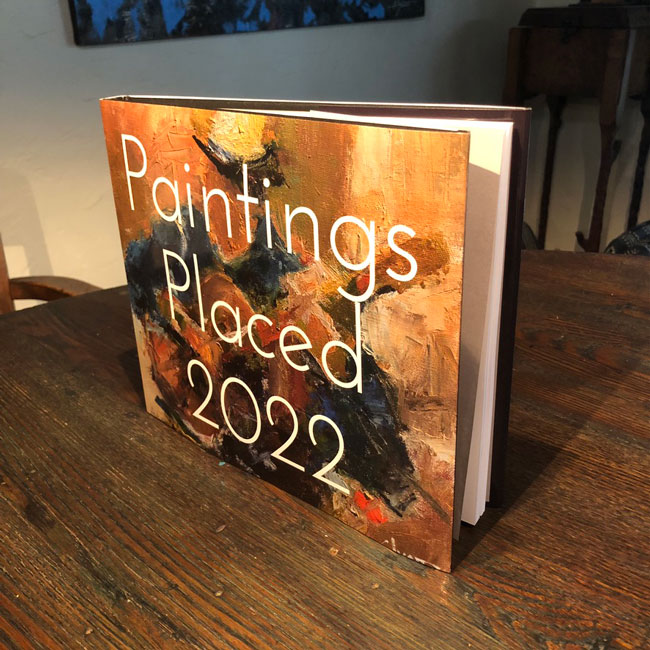
At the beginning of last year I made a one-copy-only book of the previous year’s production. I did it the two years before, too. Haven’t got around to doing it for 2023 . . . we’ll see if I do.
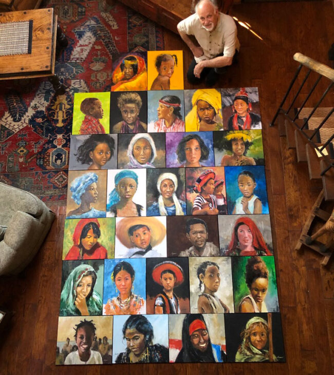
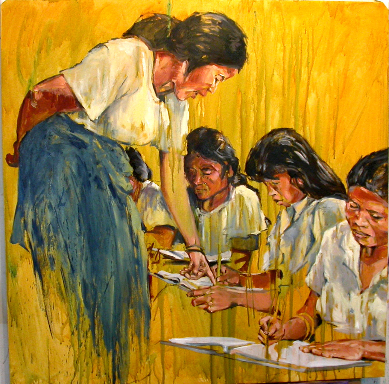
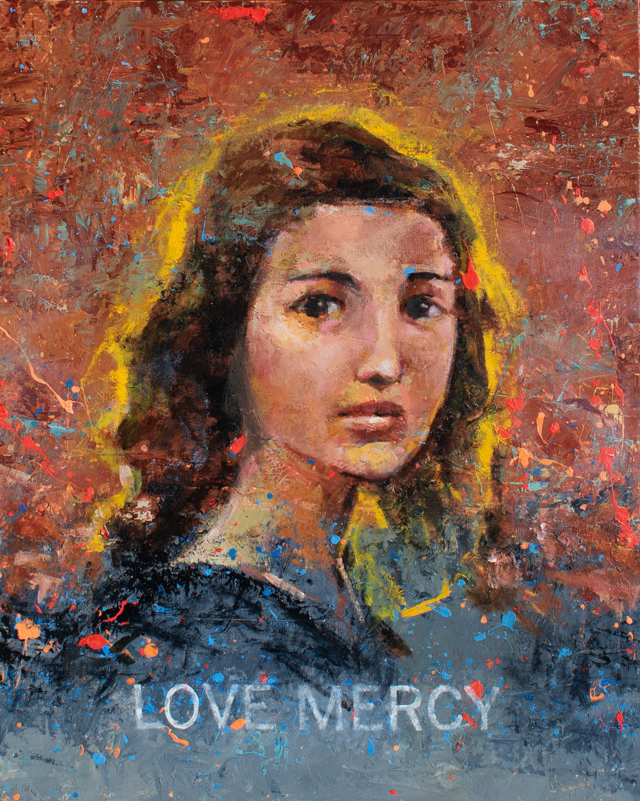
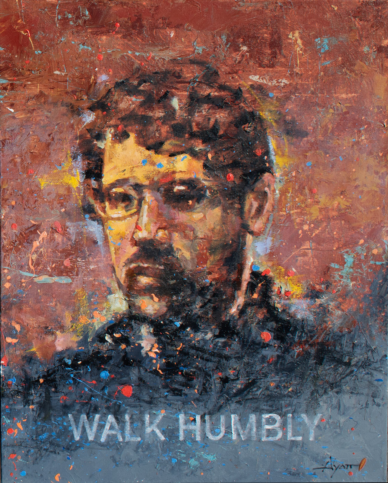
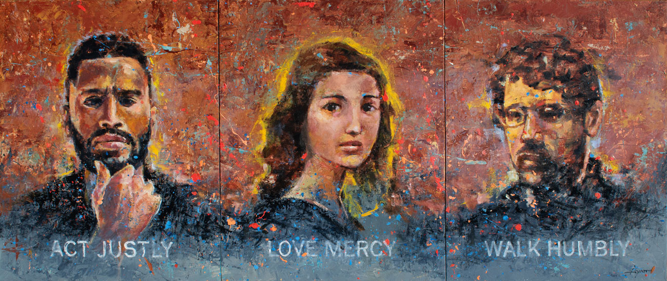
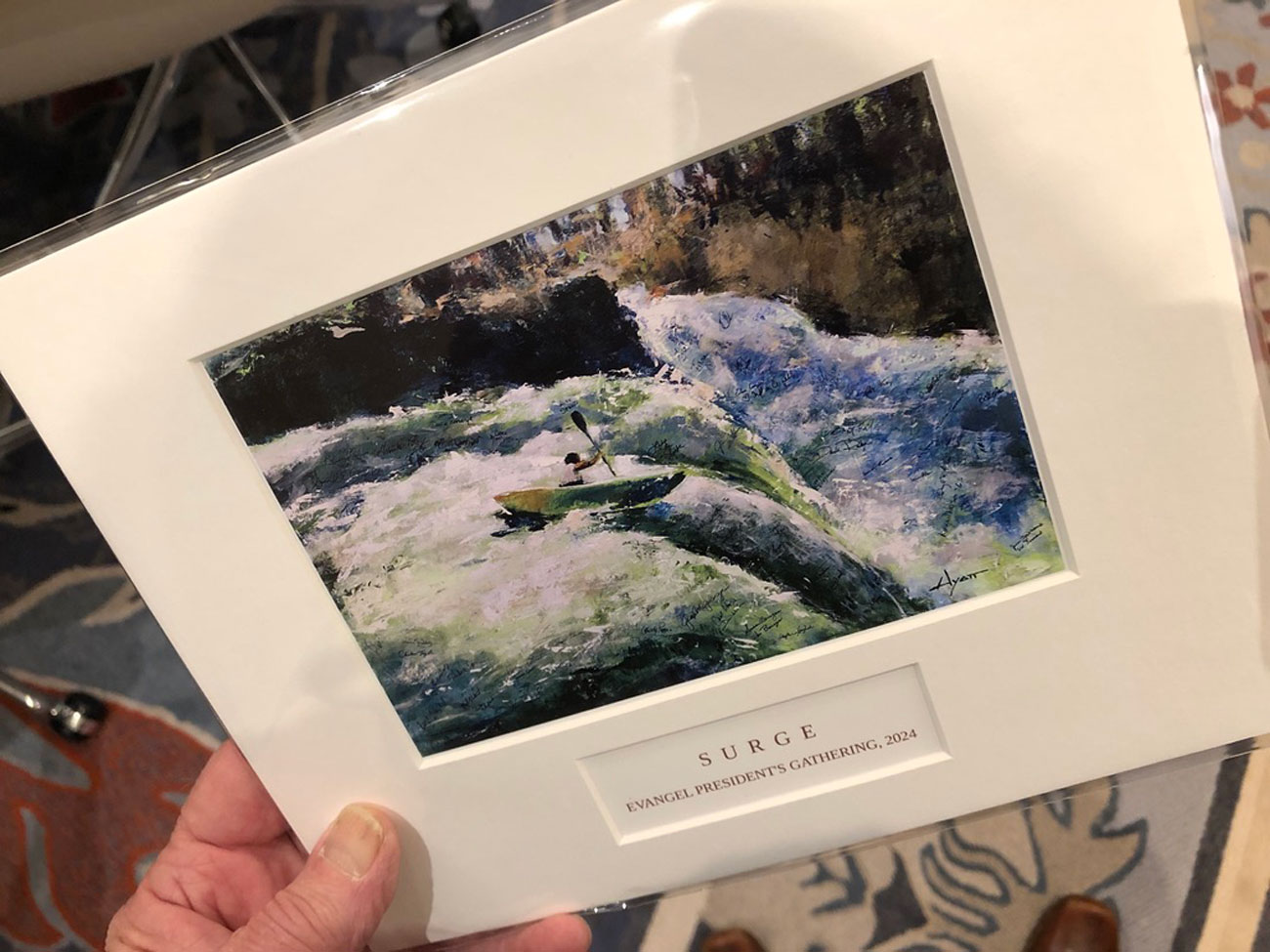
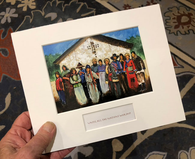
I finished and delivered a 29-painting commission for a special event held in Guatemala. Recipients were those contributing to Bible translation, the paintings matching their particular interests. I’m told it was a great success and a very meaningful gift.
.
FEBRUARY

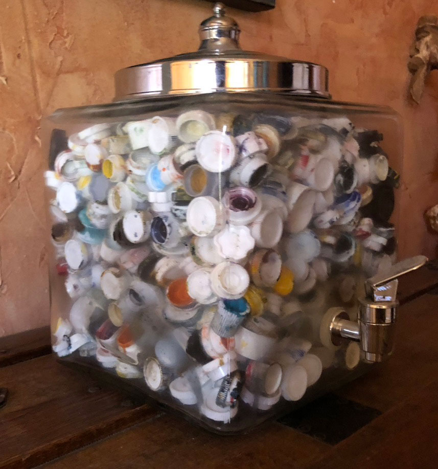
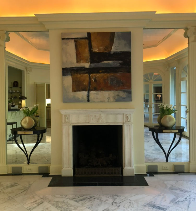
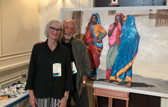
I ran a creative contest online, mainly Facebook and Instagram, challenging people to guess how many paint-tube caps in the jar. To enter, participants supplied a photo of some blank wall in their house that could use a painting. The prize would be an original painting. Many entered; the closest won.
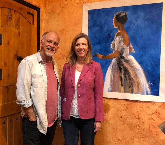
The winner received this beautiful painting. I gave her a choice of two, and, her living fairly near, delivered it to her home. Looks beautiful on her formerly blank wall. Everybody happy.
.
MARCH

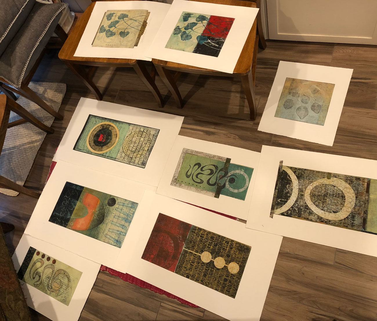
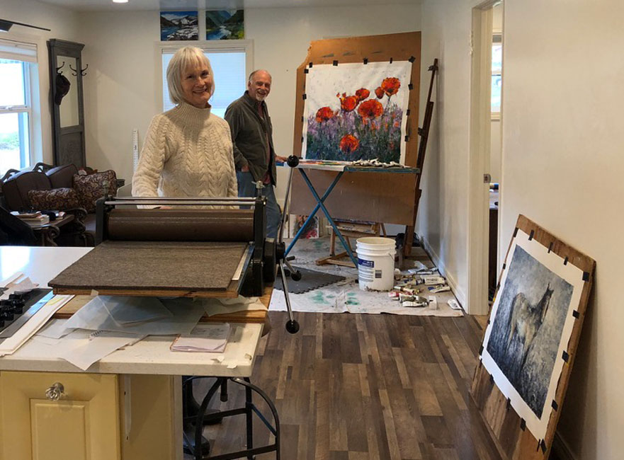
It was still winter when we traveled to the Trinity River area of northern California for two weeks of art making. It’s something we do twice a year, somewhere. We’d been to this location, Big Flat (population, 78) a couple times before, loving it always.

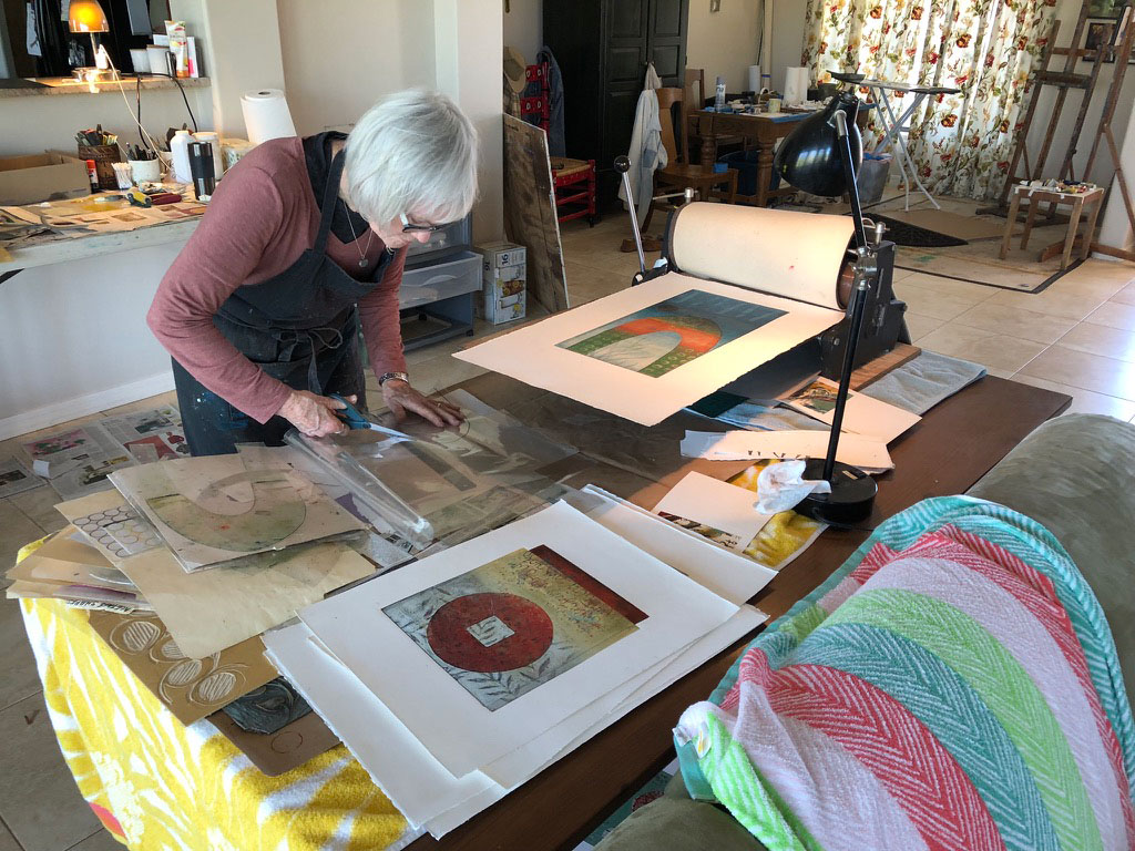
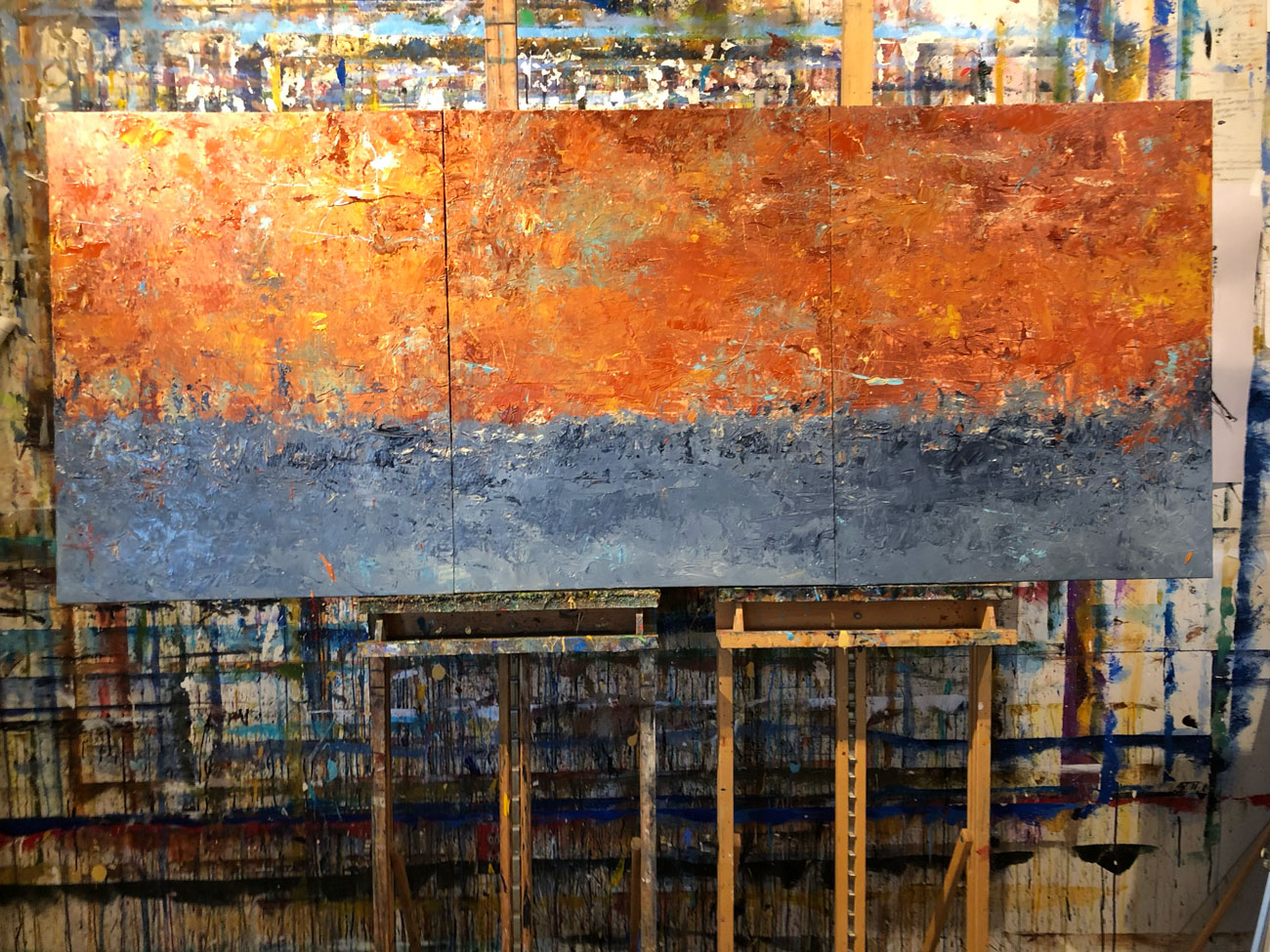
The set-up space was small but adequate. We bring Anne’s press and all the paraphernalia. I bring a bolt of canvas and cut what I need. That big board on my easel is something I found on the property. (The Lord always provides.)
.
APRIL
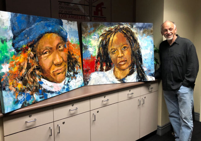
Thinking the Los Angeles Mission might enjoy an array of paintings for their halls honoring some of the homeless people they serve, I made two as gifts. We’ll see if the larger vision ever comes to pass; in the meantime, here’s the day I delivered them. I’m told they’re well appreciated.
.
APRIL (continued)

After many sketches and a number of meetings with the arts committee in San Juan Capistrano, I created three large paintings to be displayed in the historic Aguilar Adobe in that city. Approval is still pending for their outdoor use, but they’re being shown inside.
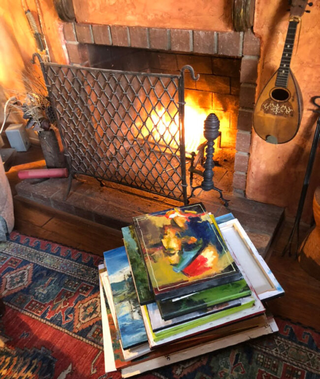
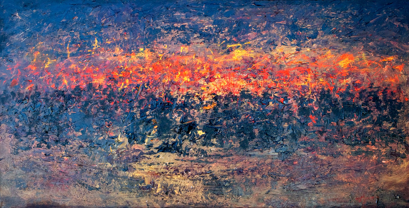
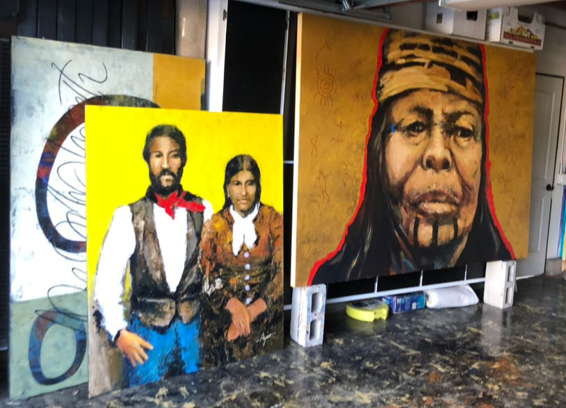
One day I had the conviction that too many substandard paintings are accumulating in my storeroom. So, this was that day’s solution. I expect the neighbors wondered about all the chimney smoke, having no idea it was art.
.
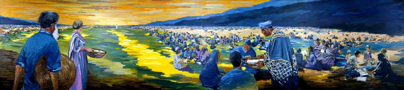
MAY
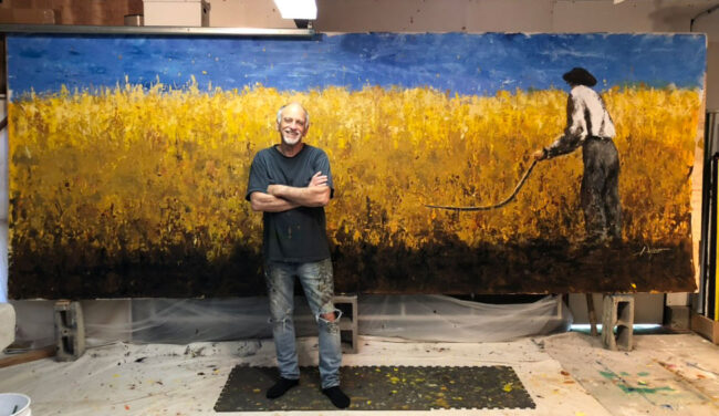
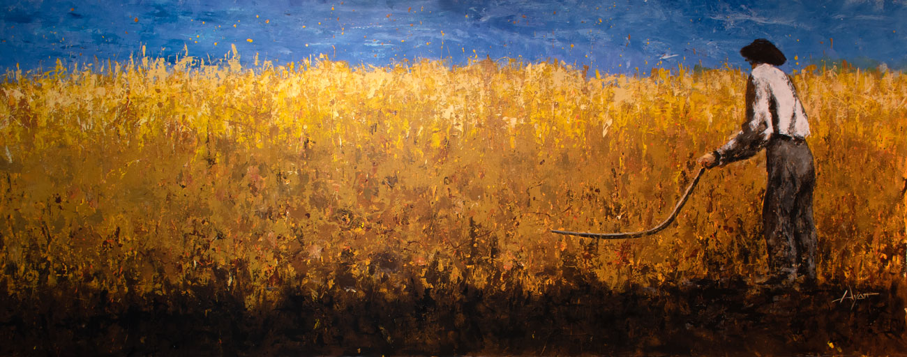
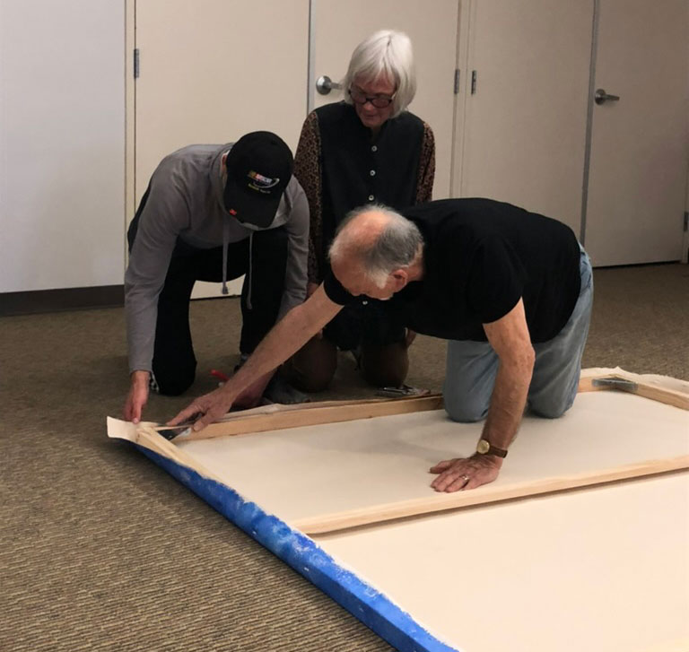
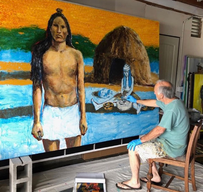
Another project that required turning that garage into a studio (there were three last year) here is the finish day of a 19-ft. depiction of “The Sower” commissioned by Biola University.

I delivered the painting rolled up and stretched it on bars made by the university’s maintenance staff. Here we are, Anne and me and a student volunteer, stretching the canvas on location. It’s now hanging in a large banquet room along with half a dozen other works of mine, some also large, procured by them over time.
.
JUNE

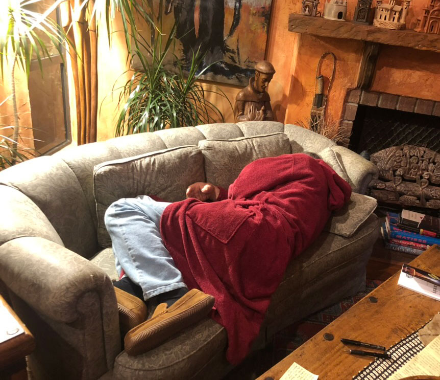
As a major surprise, for a month I lost all energy. All I could to was take naps. I’d wake and take another one, but never restored. Finally I was diagnosed with A-Fib, irregular heart beat.

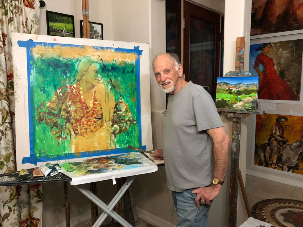
Happily I received occasional visits from friends, and all manner of support on Facebook where I kept friends up to date with my (non)progress. Here I am trying to put the best face on things.
It turned out, Anne had it, too, though manifesting in a different way. Amazingly, we were both diagnosed with it on the same day, establishing some sort of record. (Doing everything together?) Finally, we were treated with a cardio-conversion procedure, which snapped me back to right immediately. Anne’s didn’t take, but has received relief with medication. We’re both doing fine now.
.
JULY
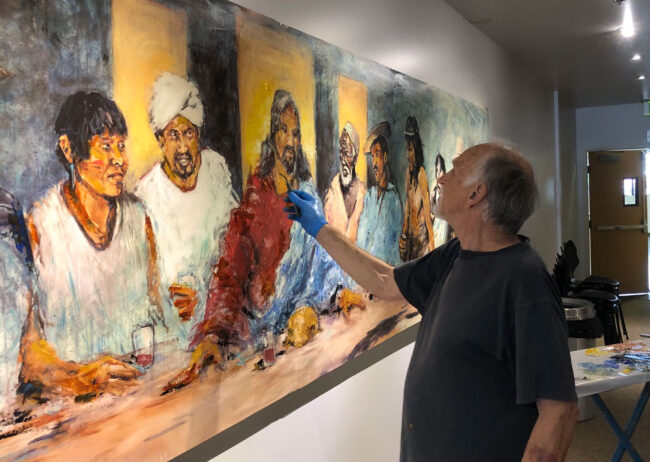
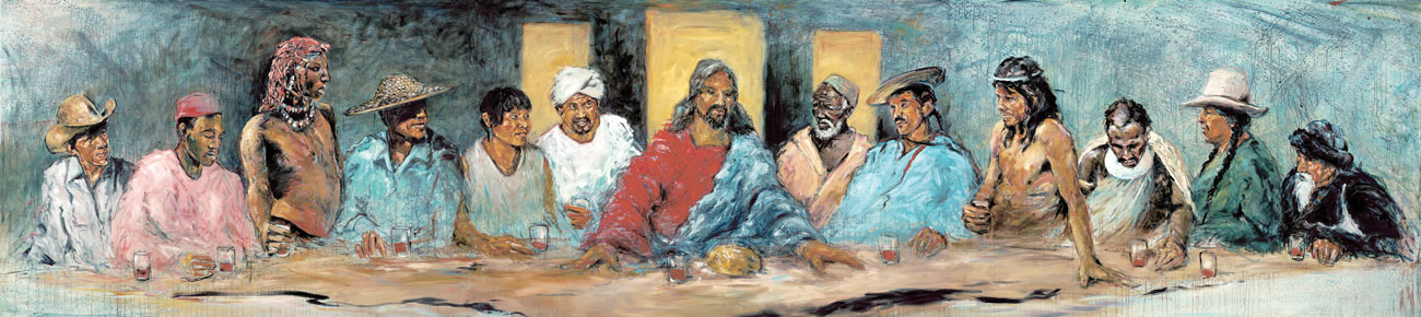
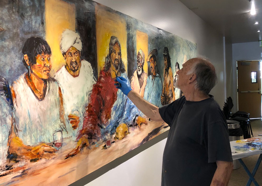
Back to work, the first thing I did after my month on the couch was to head back to Biola and do some embellishing on their full-size (20 ft.) giclee print of my famous Last Supper.
.
JULY (continued)
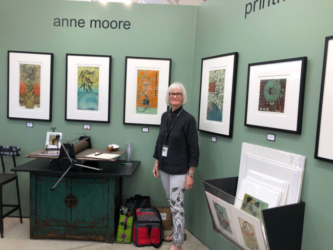
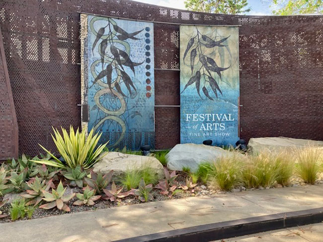
Once again, for the whole summer Anne was featured at the Laguna Festival of Arts, for the twelfth year! That’s her smaller press, the one we travel with, as part of the display, providing some orientation for guests on how her art is made. Oh, and those pants are of her art, too.
Anne was also honored last year with enlarged versions of her art as part of the festival’s outdoor display. T-shirts were also produced and on sale in the gift store featuring her art. People loved it.
.
JULY (still continued)

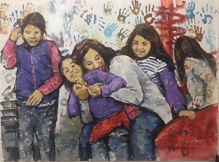
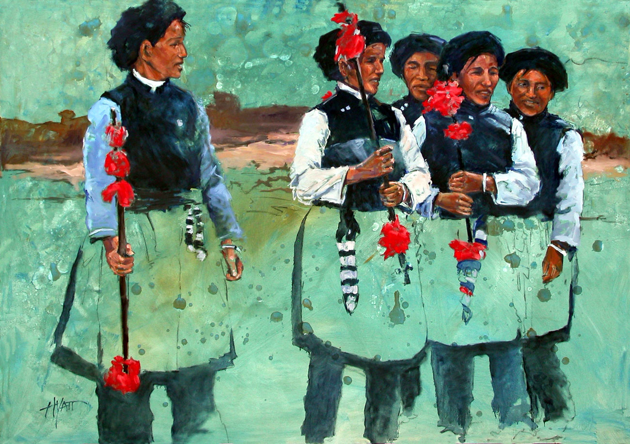
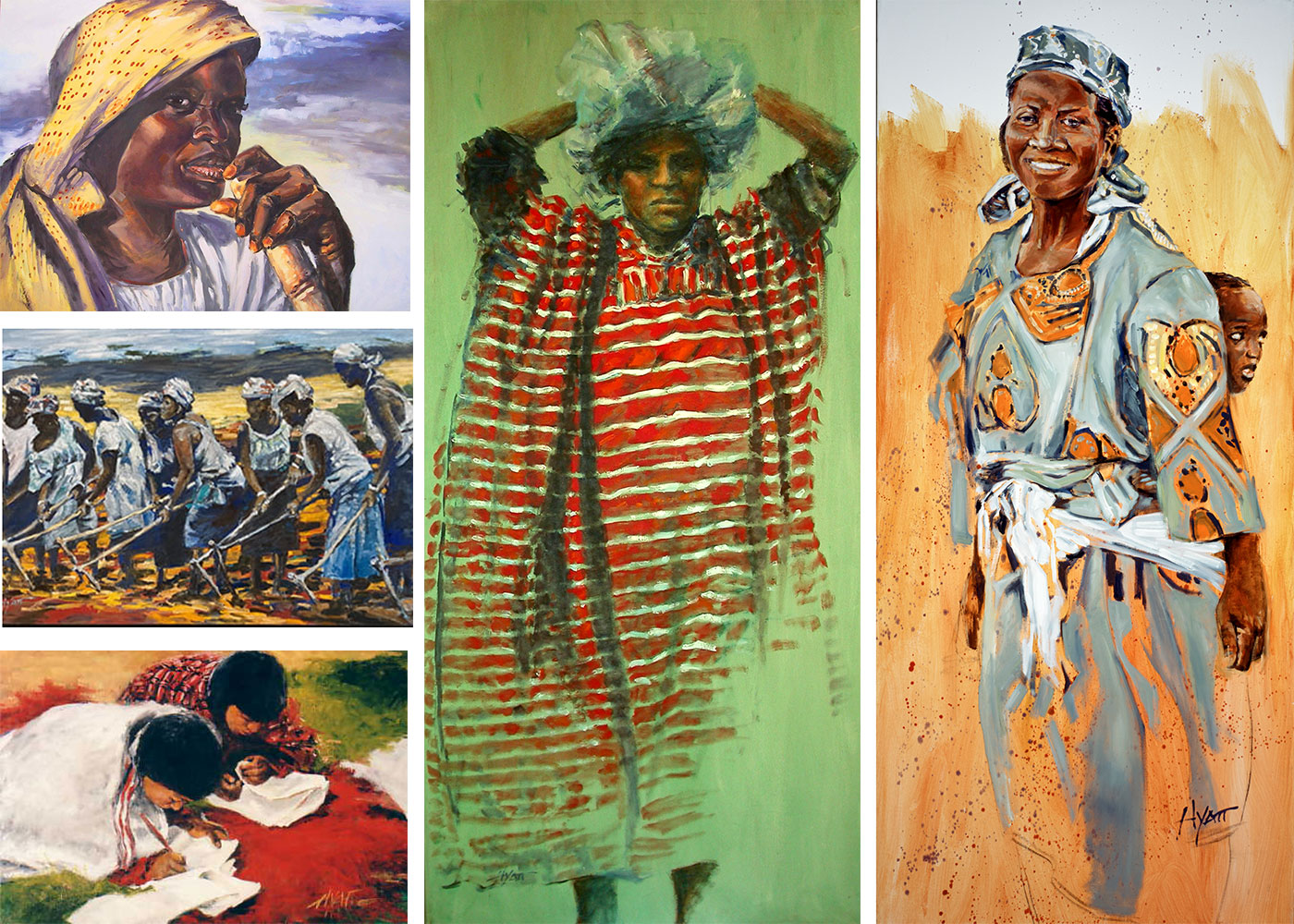
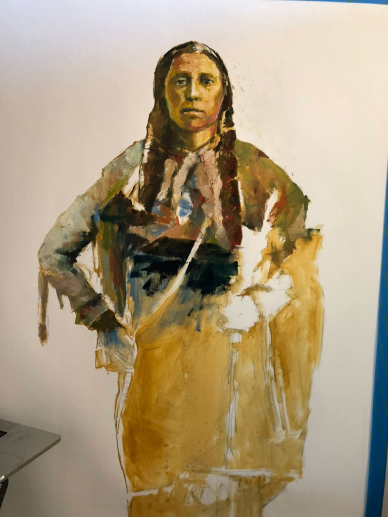
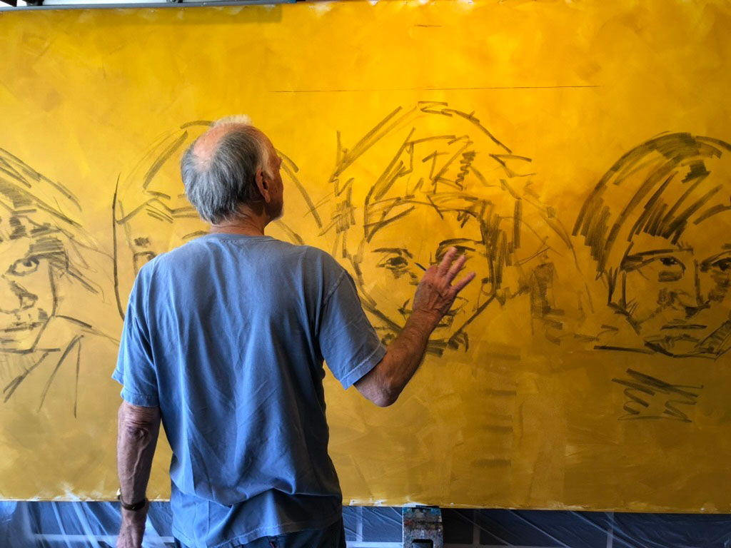
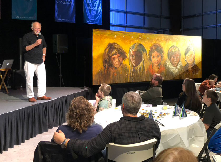
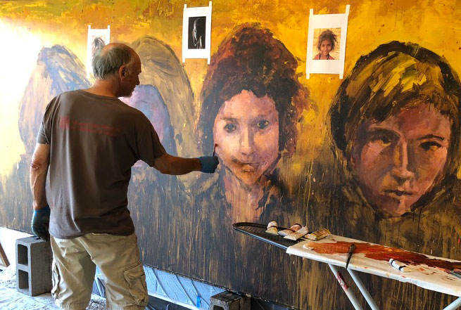
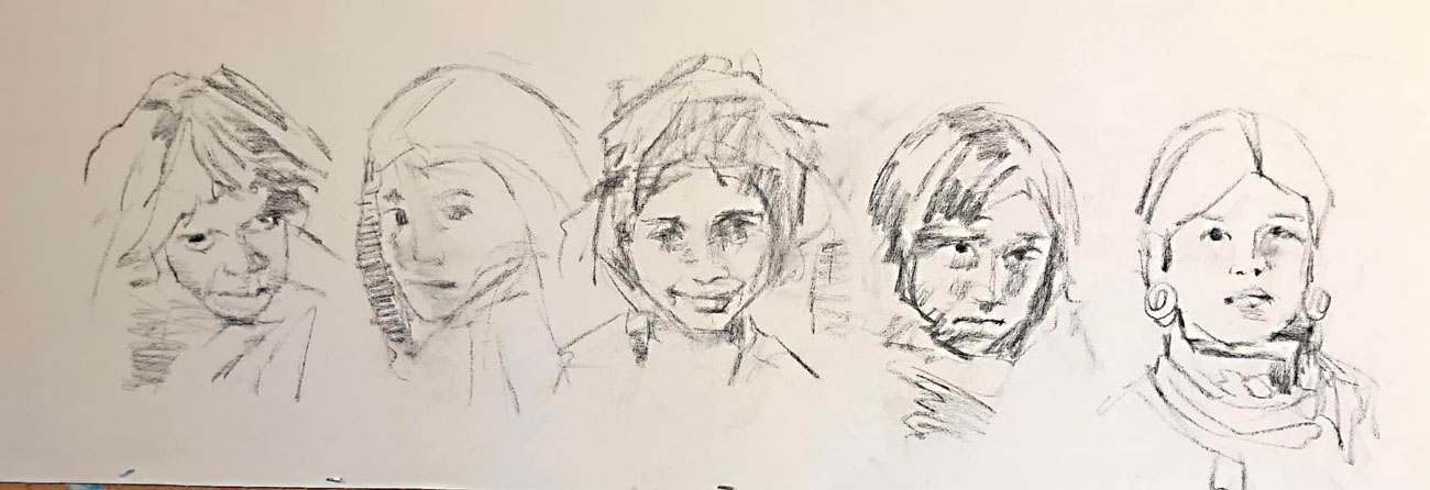
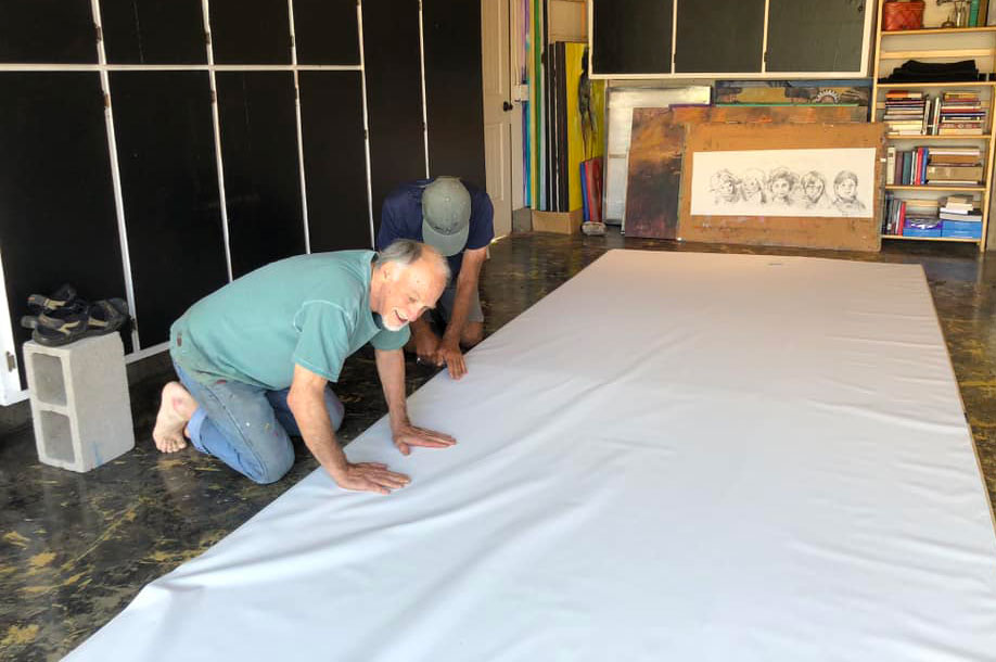
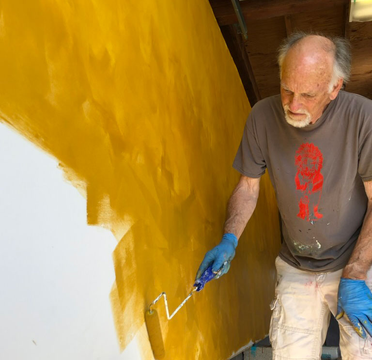
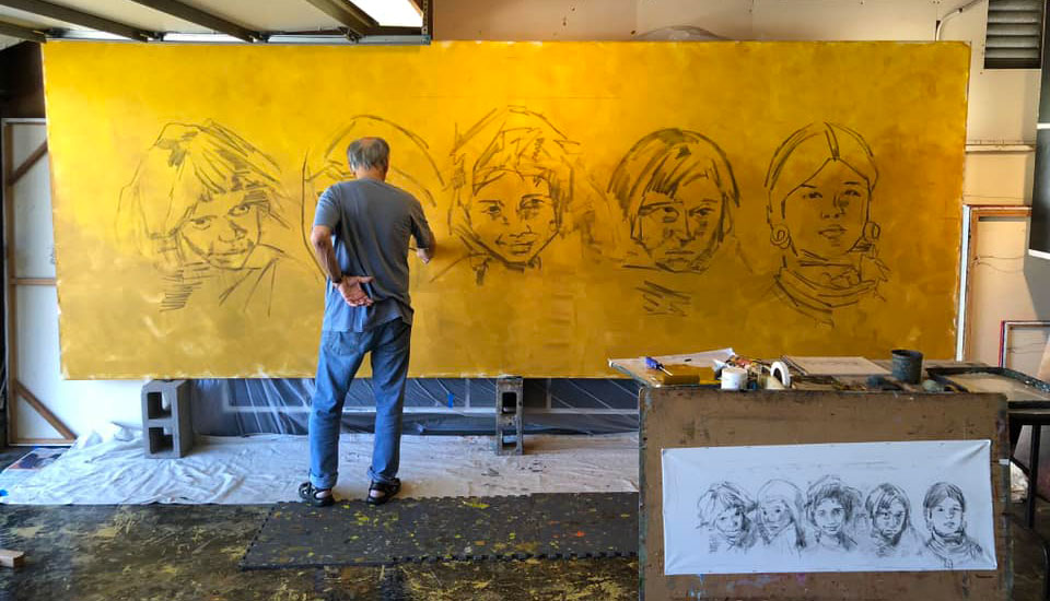
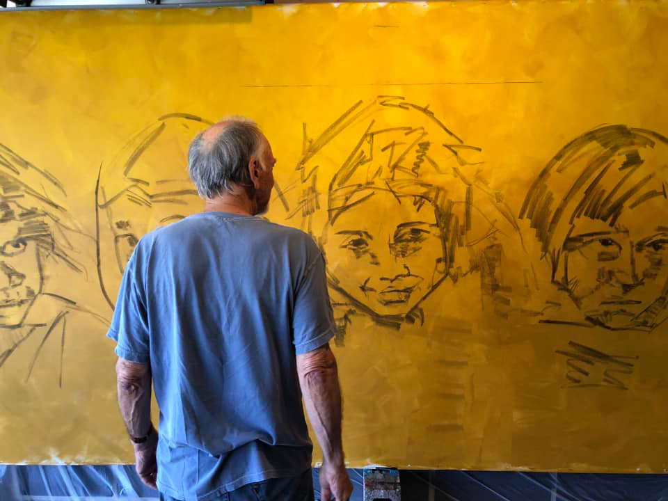
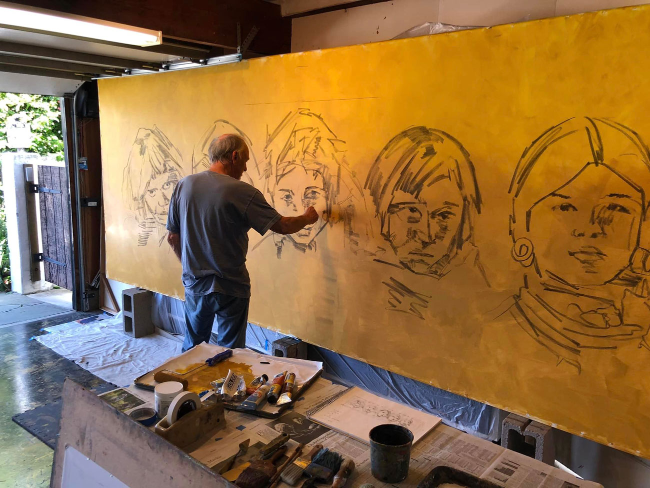
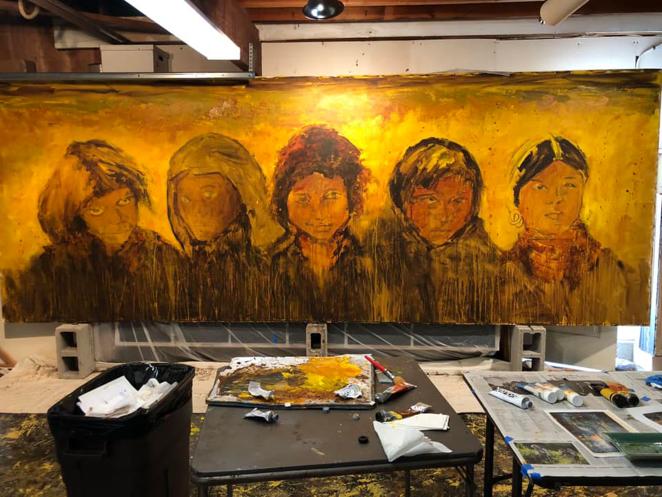
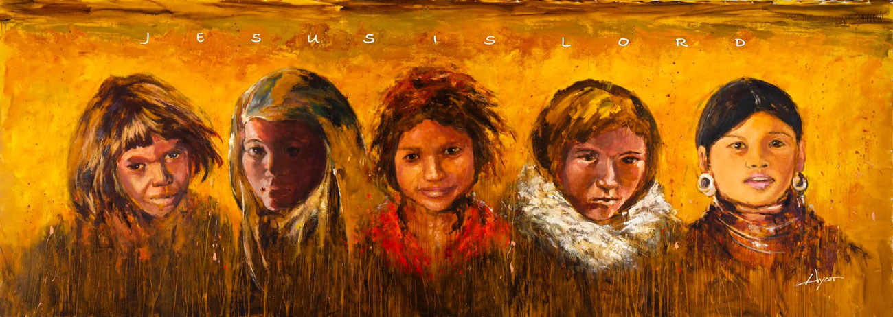
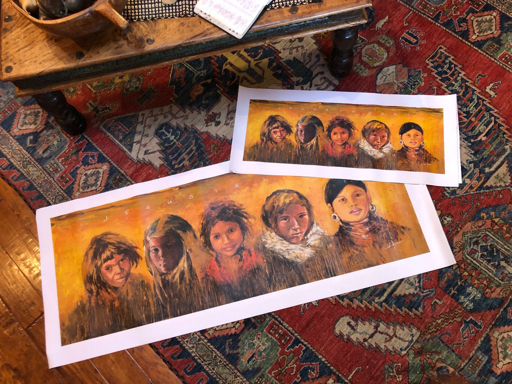
A third large project for the garage studio was a piece commissioned by Muldoon Community Church in Anchorage. By now they have a dozen or so of my works, most of them large. For this they wanted representatives from five nations with whom they’re involved. It was my choice to depict children, and which children. Here’s the charcoal stage, the background color already on.
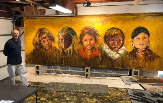
Here’s the painting almost completed. Featured is an Australian Aborigine, a girl from Burkina Faso, one from India, an Alaskan Inuit, and a tribal girl from Thailand. I shipped it rolled up.
.
AUGUST

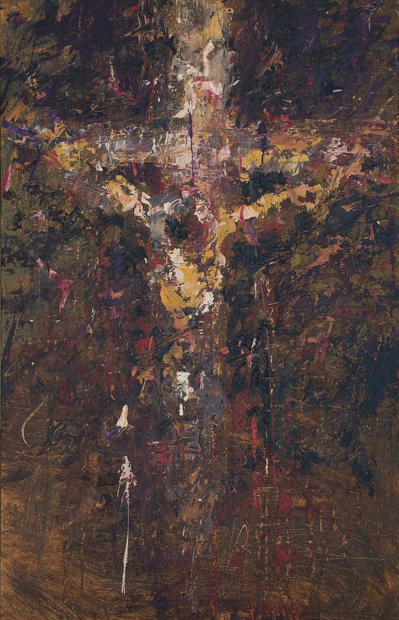
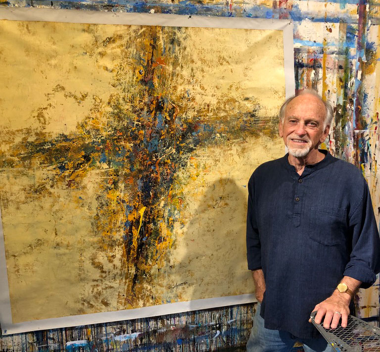
One morning, out of the blue, I received an email from an architect in Prague that I’d worked with once before, then for a project in Florida. On a long shot, she was asking if I could make a painting of a cross, abstract, in beige colors, 48 inches square, and contribute it for free. She would need it in a week! At first I thought, “What?” Then I remembered I had something like that, produced on spec a couple years earlier. I located it; it looked like might work. When I measured it, it was 48 inches square. Incredible!
Suffice to say, I sent it and they loved it. Here’s the wall they were planning to put the painting on (then still thinking it might be a horizontal piece).
The whole story was quite amazing, and of course, they’re grateful.
.
AUGUST (still)

This year saw the completion of my three-part memoir, The Rear View Mirror. The last one, “Art Takes Over,” and the final edits on the others, were completed by September 1, always my date for completing or starting things. (My birthday is my personal fiscal year.) Each volume is over 200 pages of great reading (of course), complete with photos. Available on this website and on Amazon, $12.00, cheap!
.
SEPTEMBER
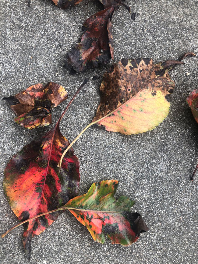
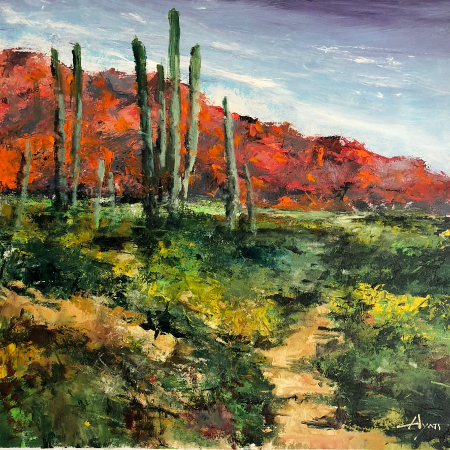
As mentioned, 2023 was a birthday year, my 80th, illustrated here by leaves, mature with age, where we were in Santa Barbara. Symbolic? Maybe. And maybe there’s still plenty of color ahead. I’m optimistic.
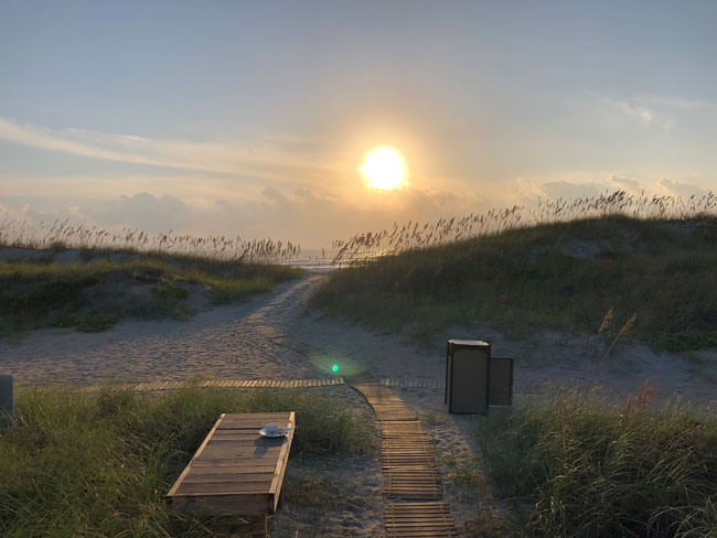
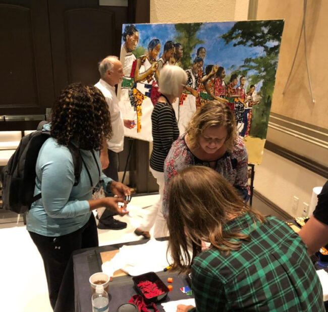
The beginnings of fall inaugurated a season fuller than most, with five public painting events, visits to our children and grands in Grand Rapids, Nashville and northern California–as well as travels elsewhere. Pictured here is the beach at Amelia Island, Florida, where we went to do a public painting.

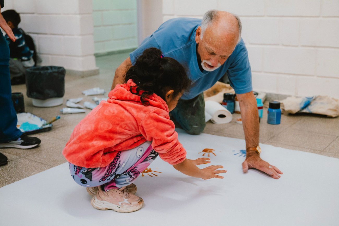
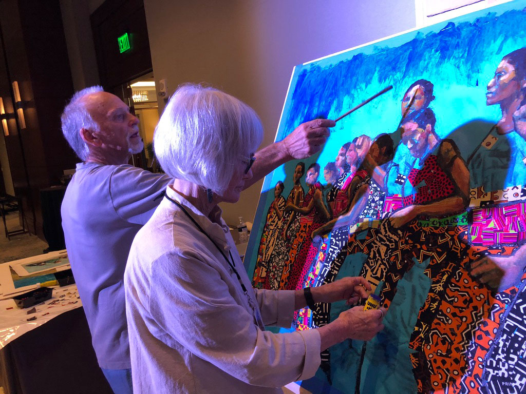
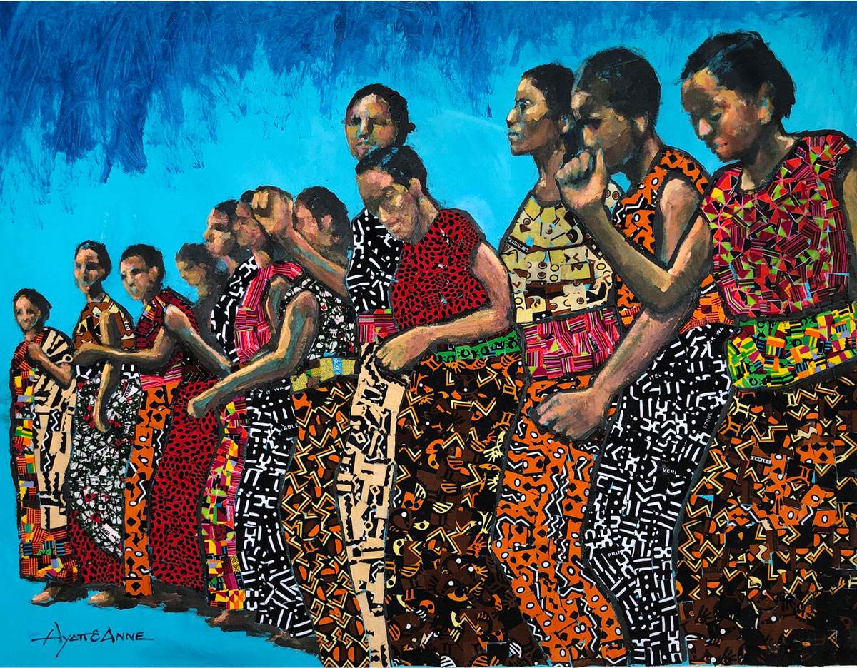
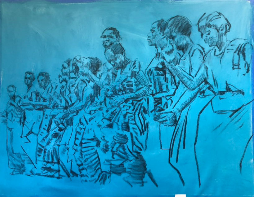
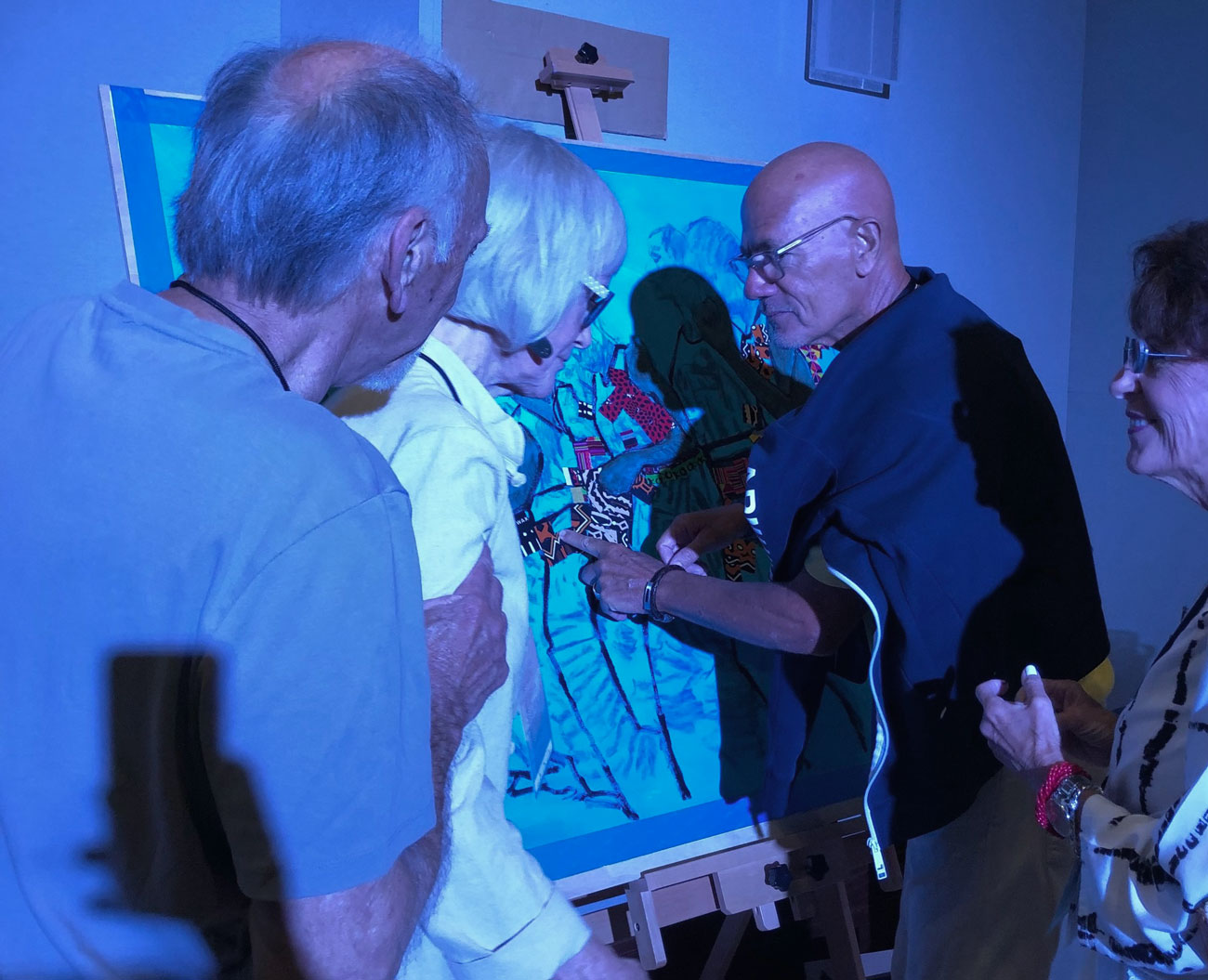
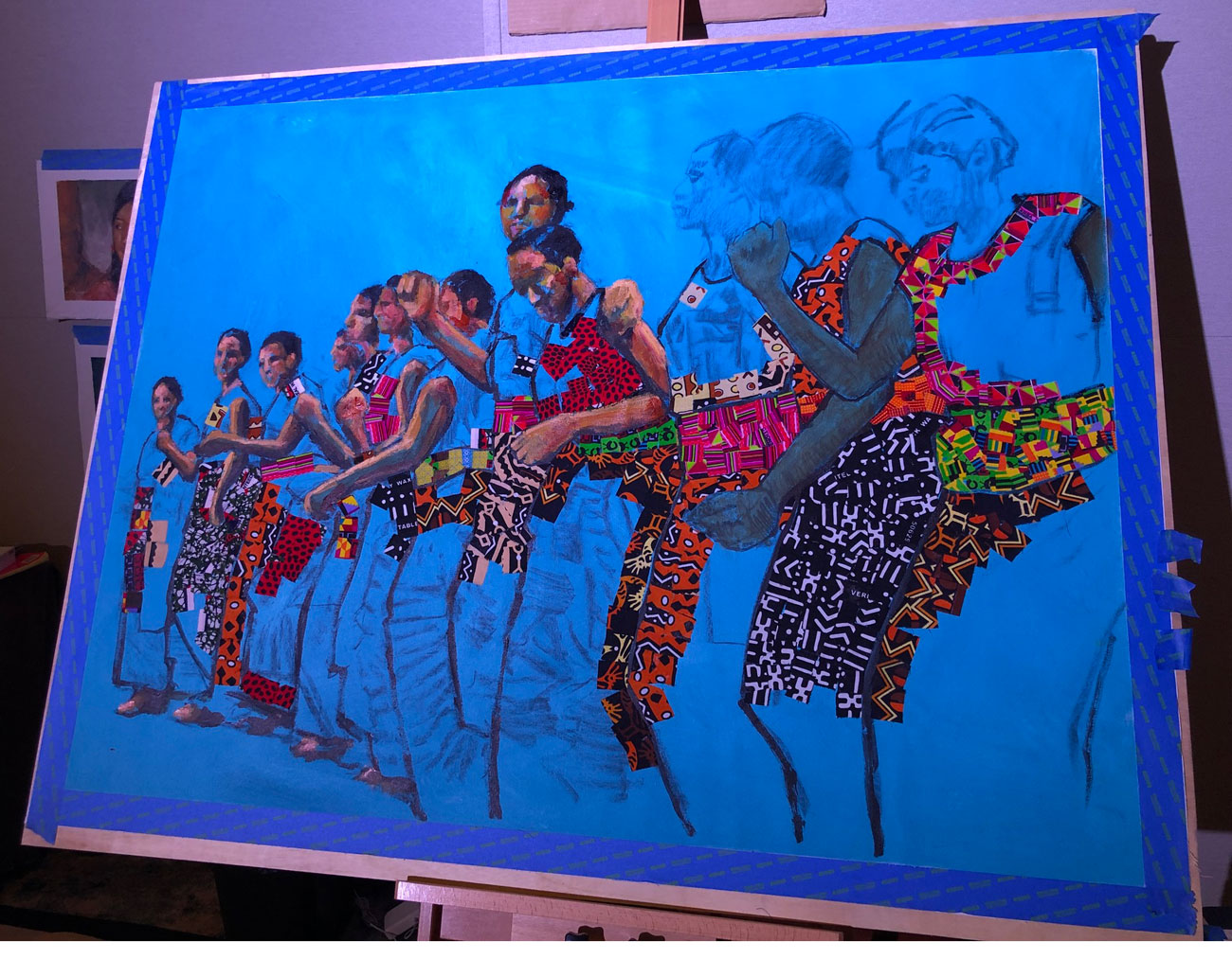
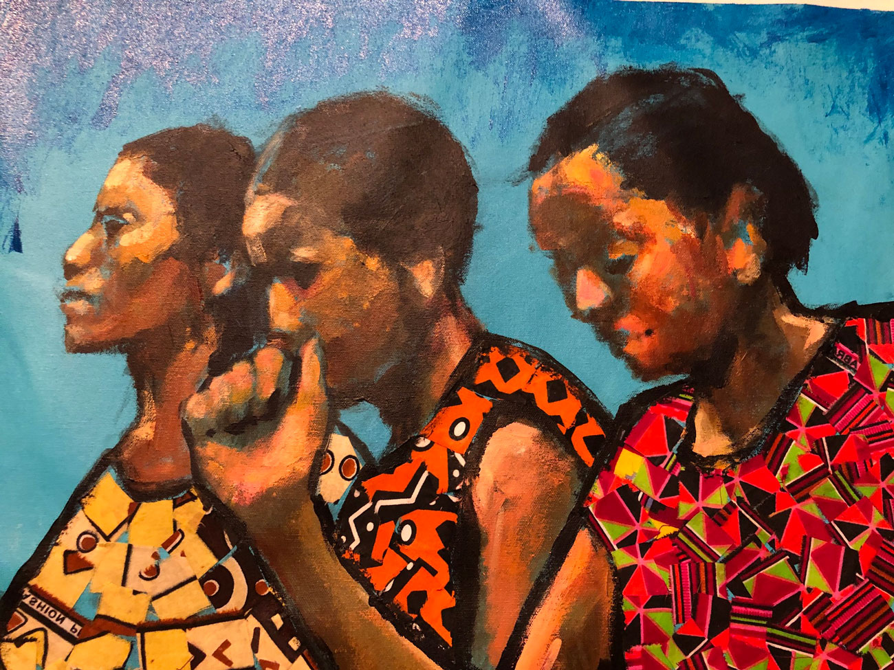
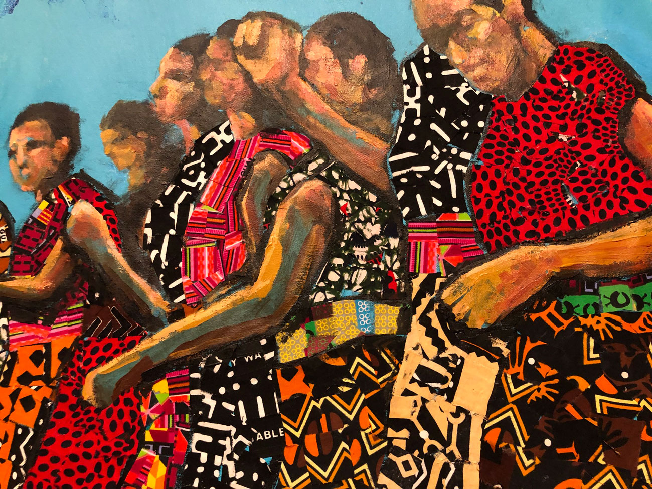
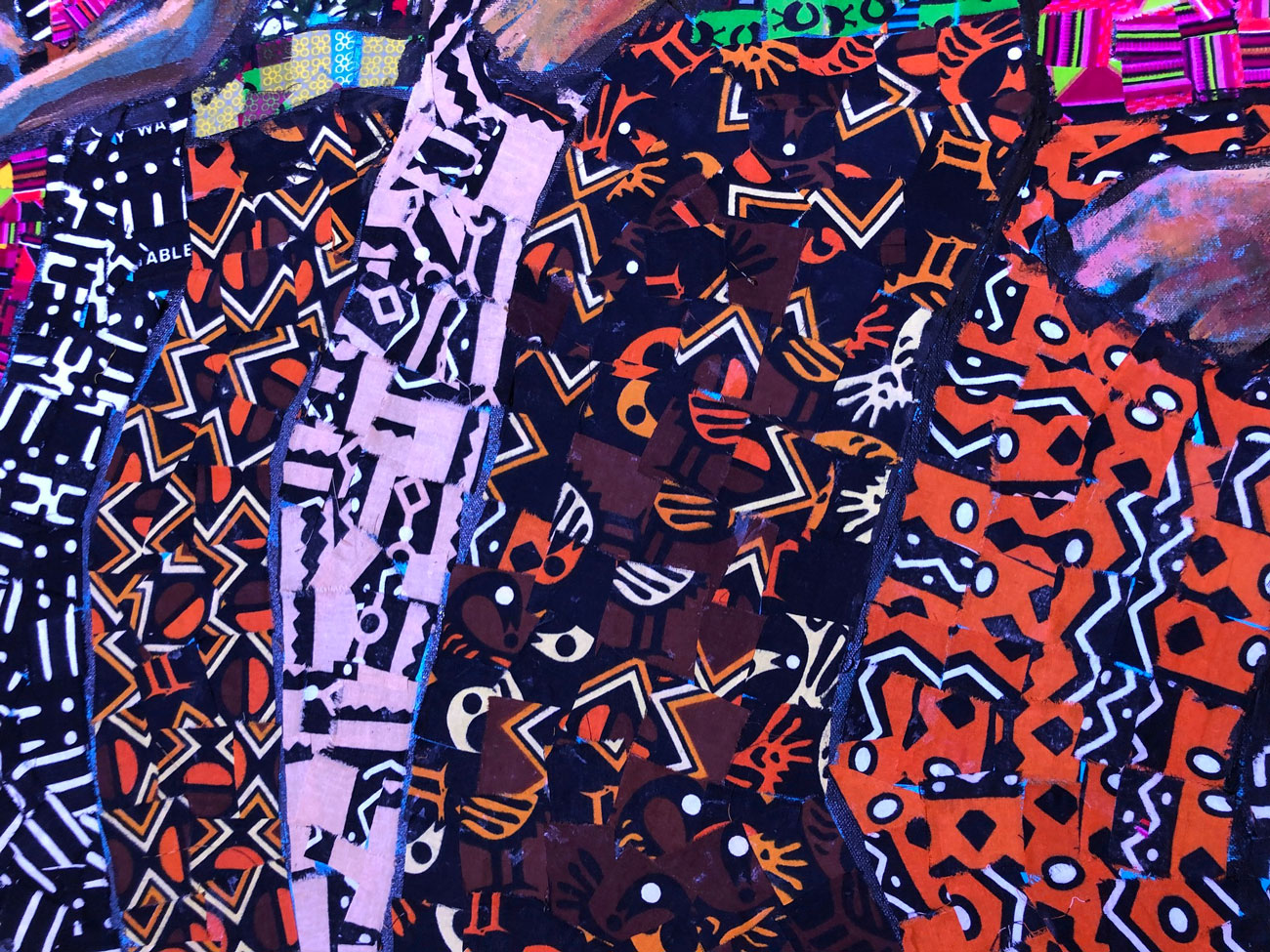
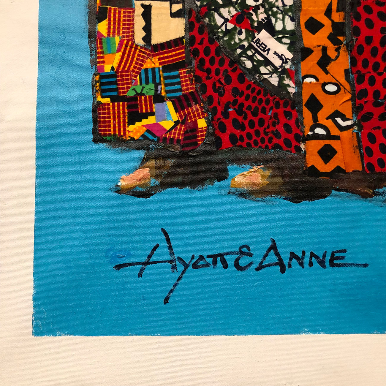
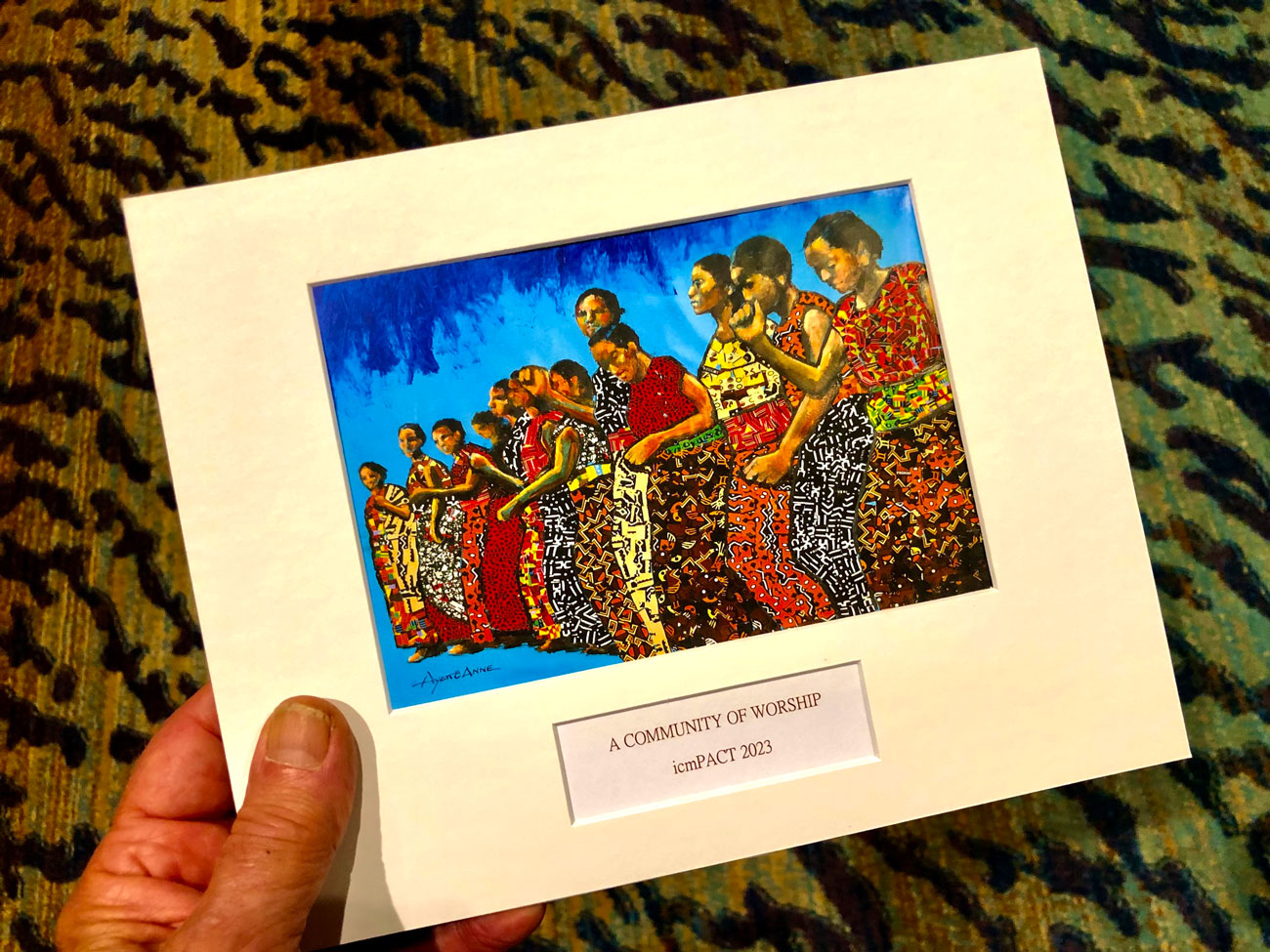
In this one, for International Cooperating Ministries, as a creative departure we glued cut pieces of African fabric on the canvas. Event guests also participated in this, making it a fun project for all. Actually, Anne did the lion’s share of the work.
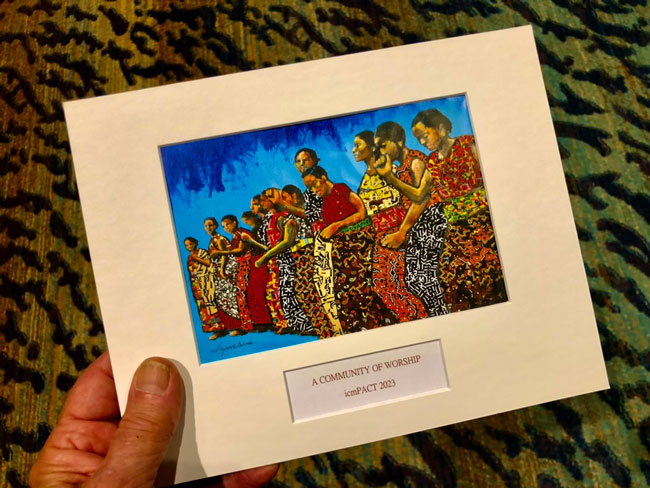
As normal for these, we made small prints of the finished work and assembled them into precut mats to give as take-away gifts for all who attended (and helped make the art).
.
SEPTEMBER (continued)
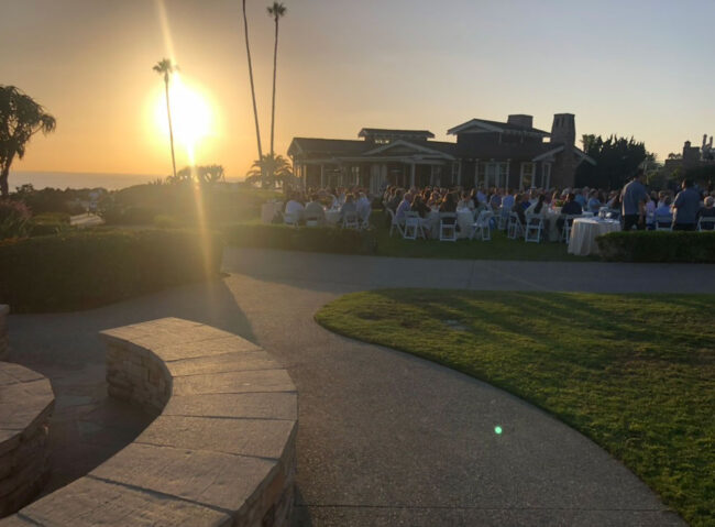
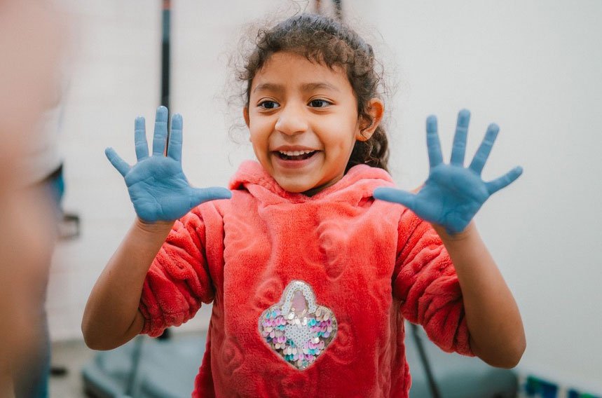
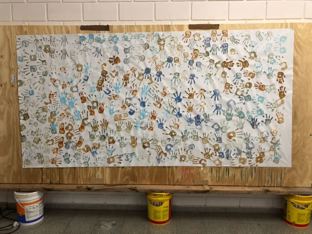
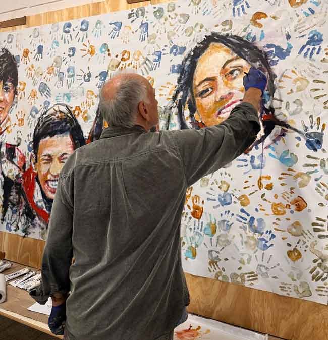
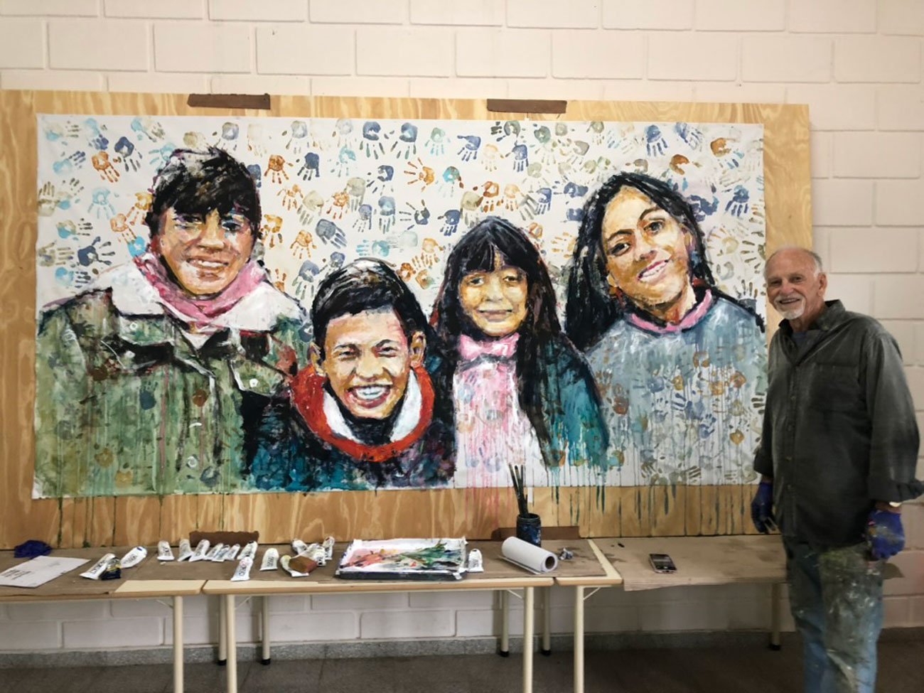
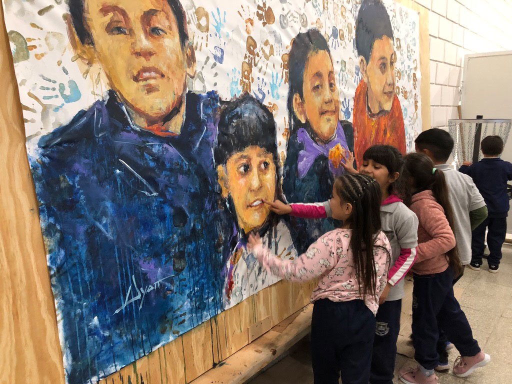
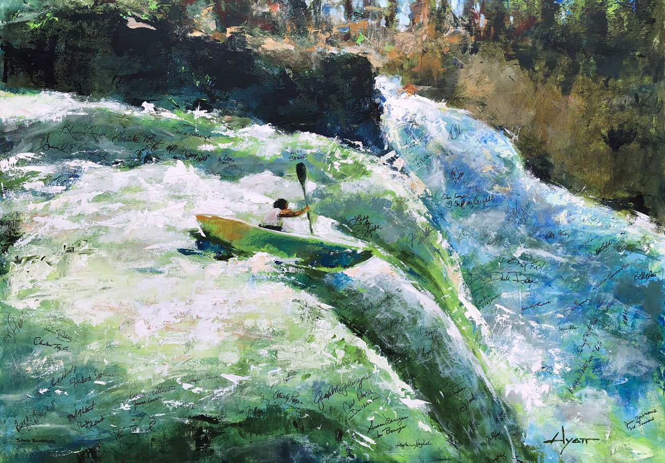
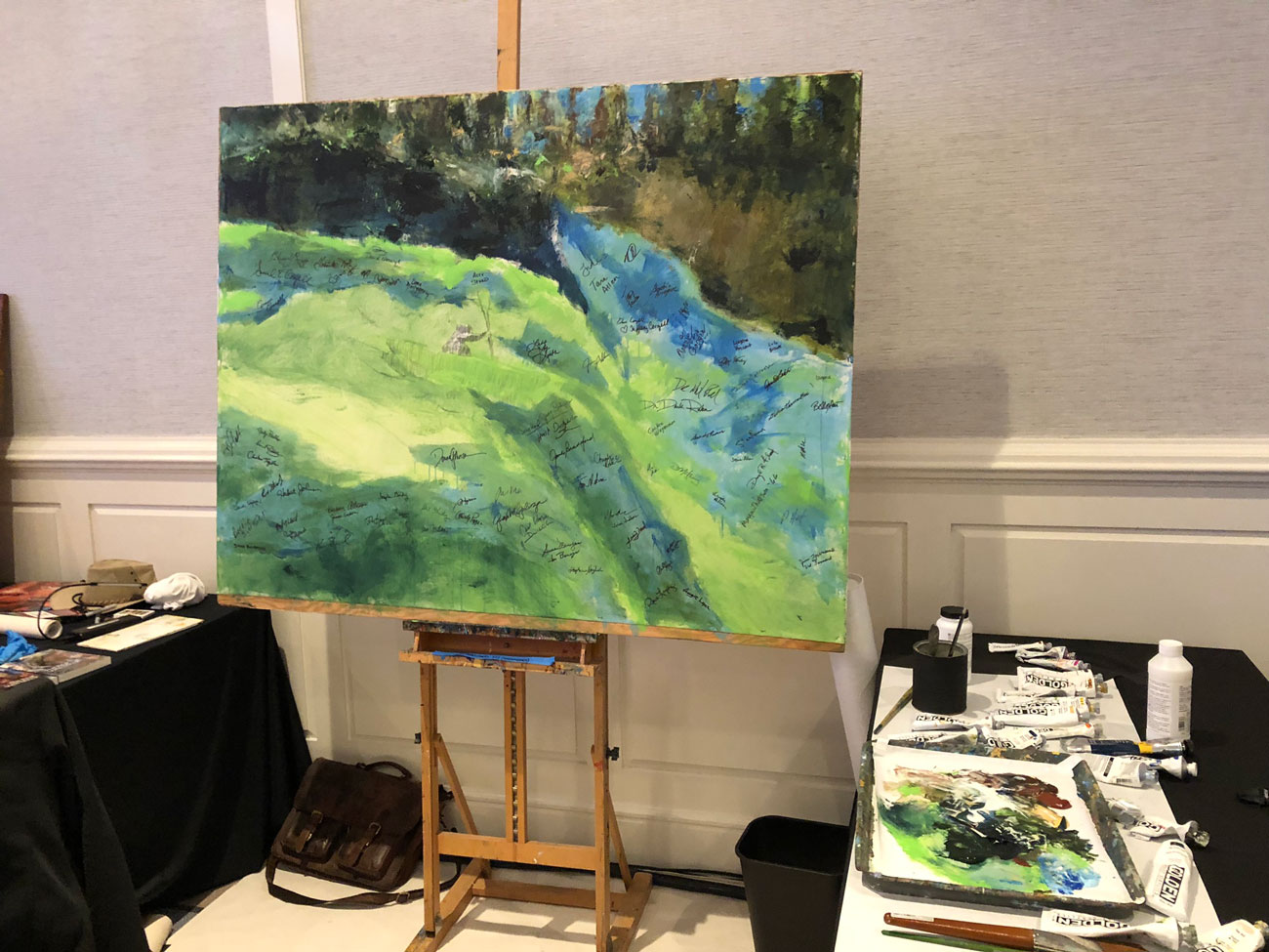
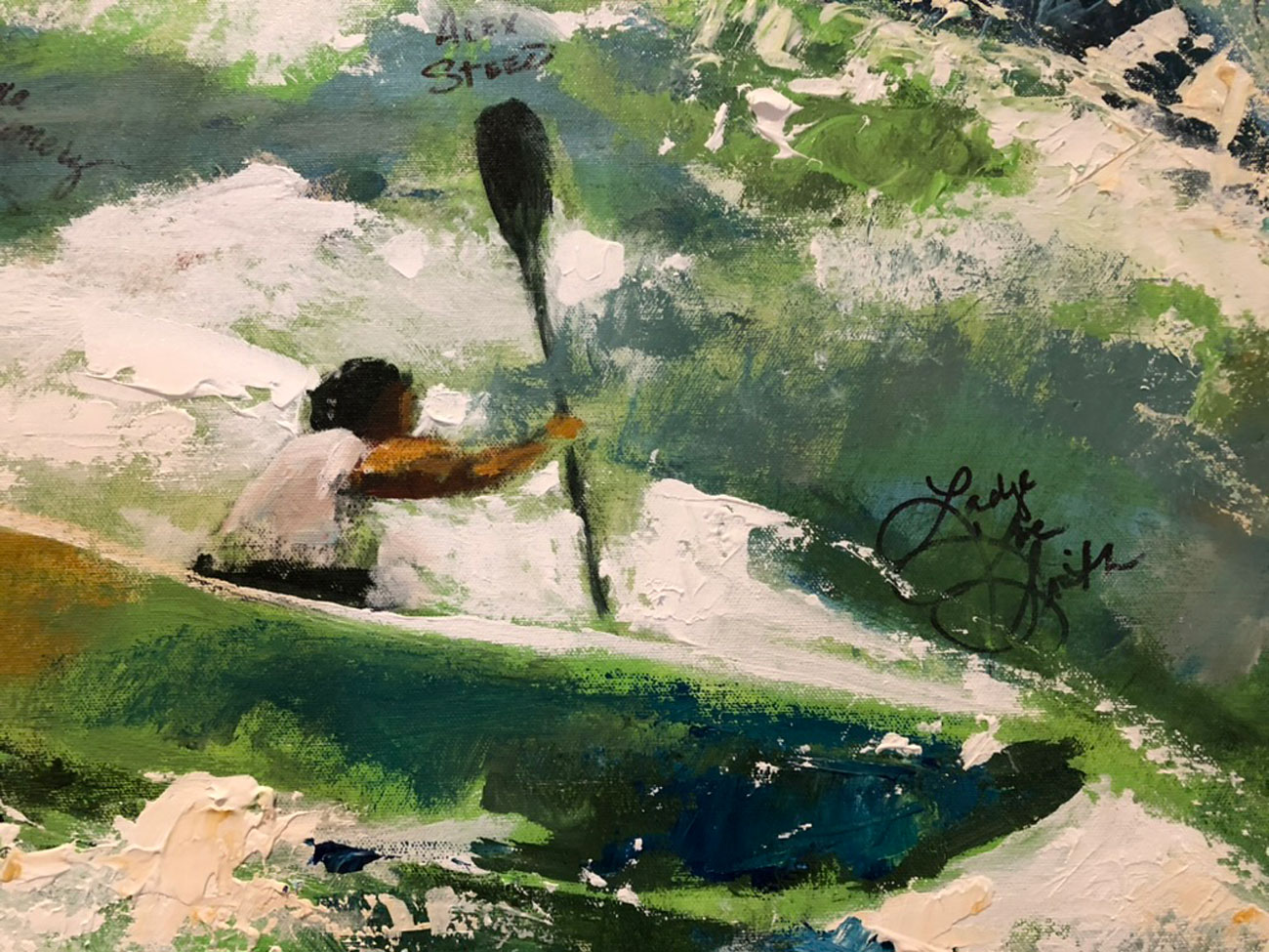
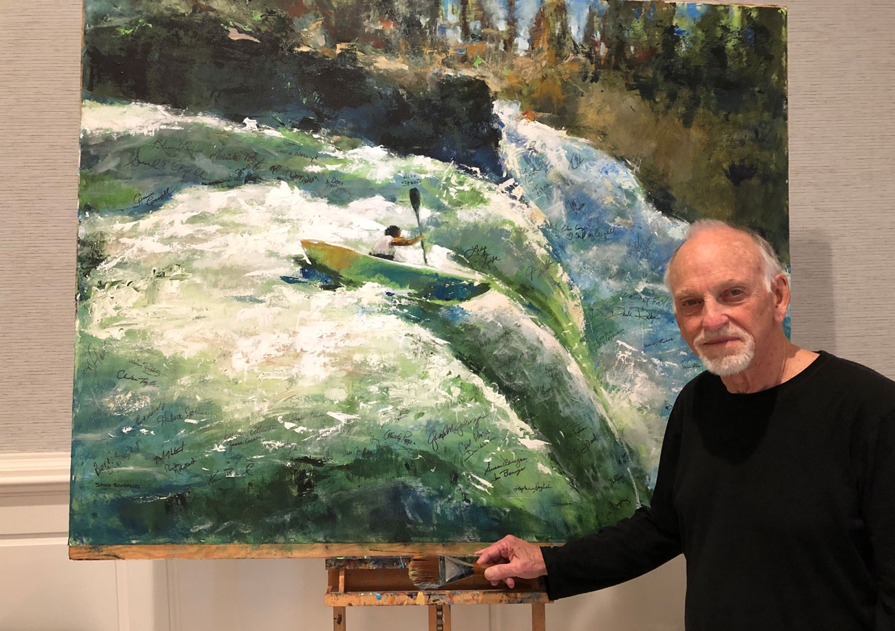
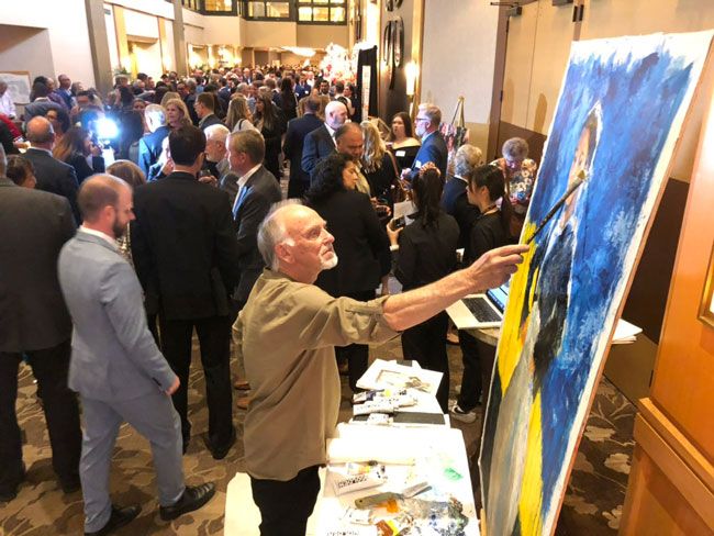
Just a week after the event in Florida we participated in another in Southern California, at “The Montage,” in our neighborhood. This one was for Wycliffe Bible Translators, an organization we served for 32 years–in many places and many capacities, even for five years, me being its president. But this was the first time we’ve participated in one of their events and made a public painting. It was an honor.
This time it was participants’ thumb prints that became part of the art.
The final result. The painting itself will hang in the headquarters office in Orlando.
.
OCTOBER
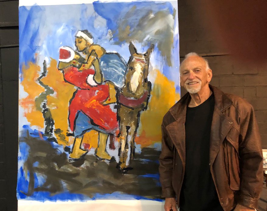
Then, another, also local, this a one-evening event for Hope International, an organization that supplies micro-loans in third-world communities. In this case, having only a few hours, I did three-quarters of the painting in advance.
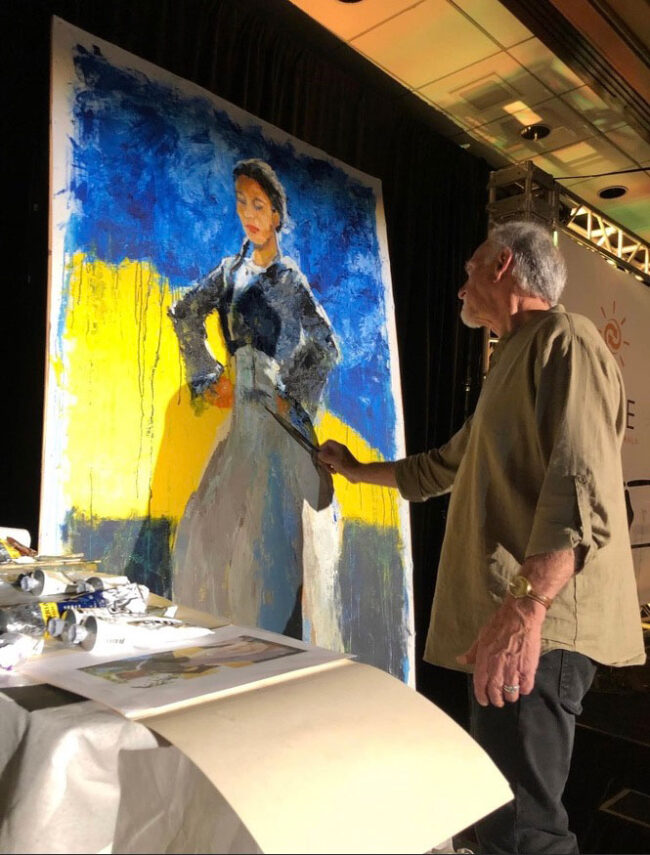
Paraguay being in focus for this event, I researched and found a Paraguayan folk dancer. The painting was auctioned that evening for a good price. It was my contribution.
.
OCTOBER (continued)

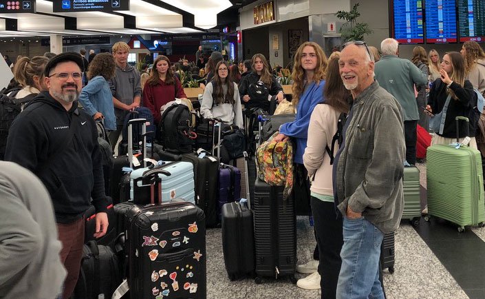
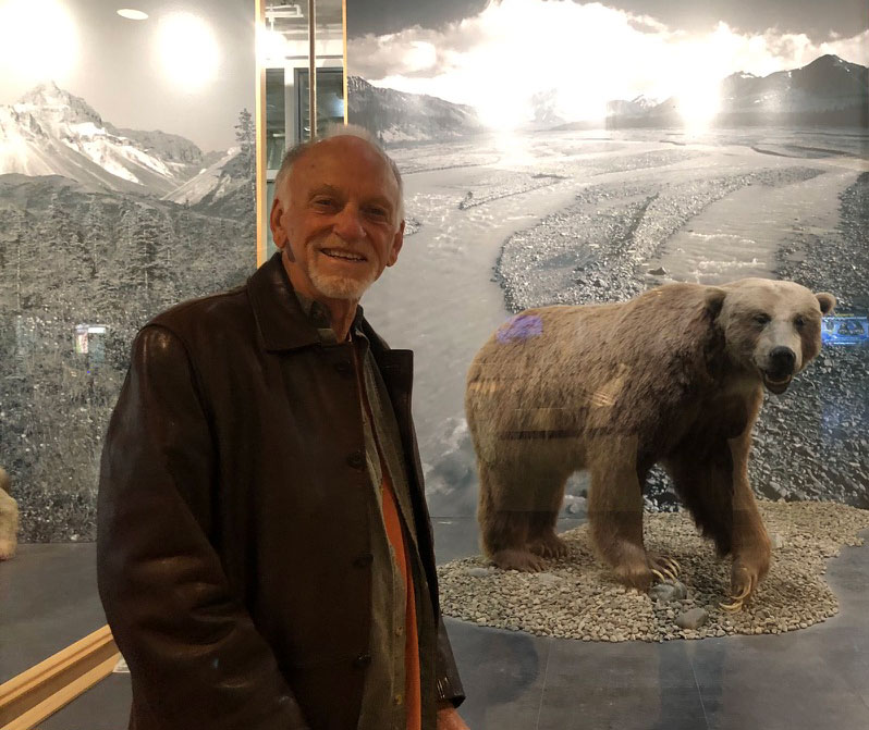
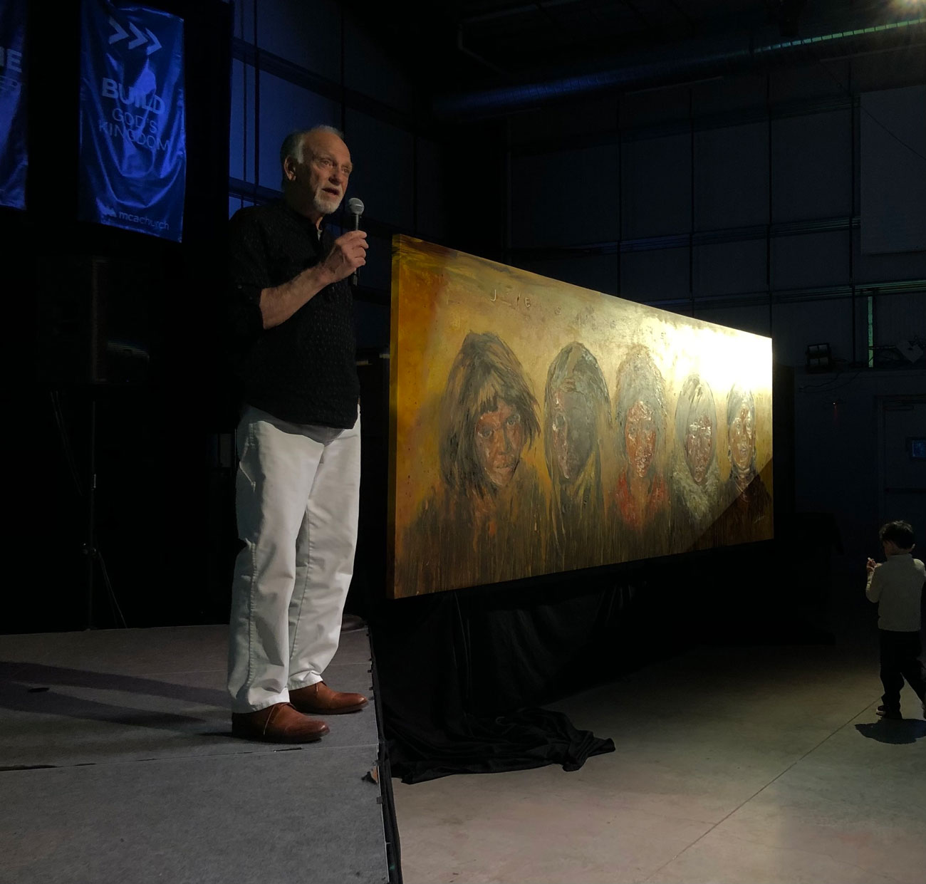
As a last minute idea I was invited to Alaska for a long weekend to be part of the unveiling of the large painting I had made for them in my garage. Here I am arriving in the Anchorage airport (after being stuck most of the day with in-transit delays in Seattle).

The presentation of the painting at an evening gathering. It now hangs in the church with about ten other of my pieces. Another “gallery.” A full size print of the painting is going to a sister church in Burkina Faso, Africa.
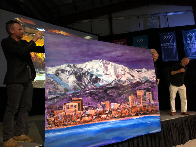
As an extra, I remembered that the now retiring pastor had always thought of having a painting of Anchorage itself. But nothing ever happened with the idea. So, thinking it was now or never, I made such a painting and surprised them with it. It’s their city, and they love the painting. It was my gift.
.
NOVEMBER

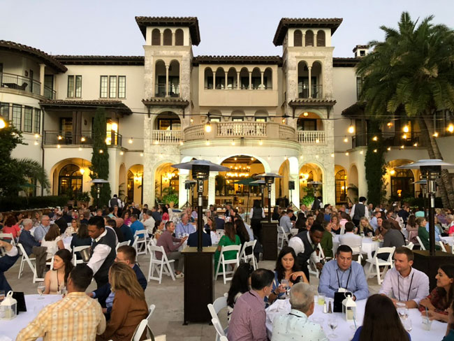
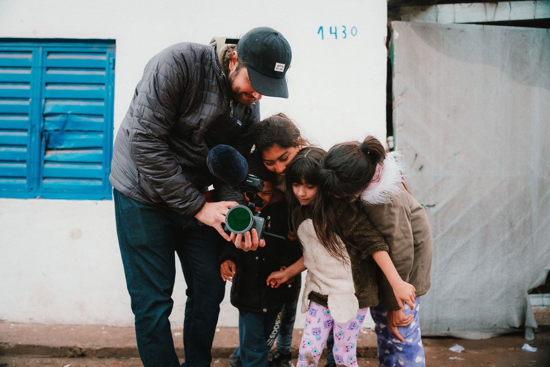
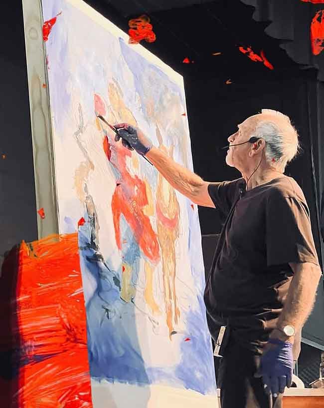
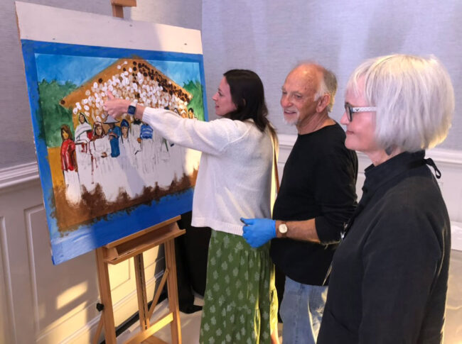
Another event, this time at “The Cloister” in Sea Island, Georgia for Seed Company. It’s always a privilege to be in these places, and with such people, committed Christians, often of means . . . to really make things happen.

Once again, it was thumb prints that helped the painting along. I’d selected the image and done the drawing at home, finishing it out on location set up in the back of the meeting ballroom during the event.
Being in the room where it all happens, Anne and I also get be part of it, hearing the inspiring content, stopping to watch the moving videos, and interacting with all the guests throughout the weekend. It’s always great.
.
NOVEMBER (continued)
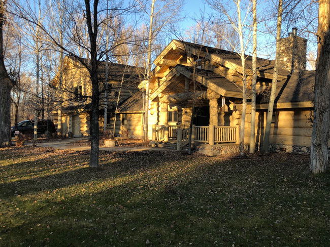
For our second art making hiatus of 2023, we went to Swan Valley, Idaho. Always very special, it was our fifth time there.
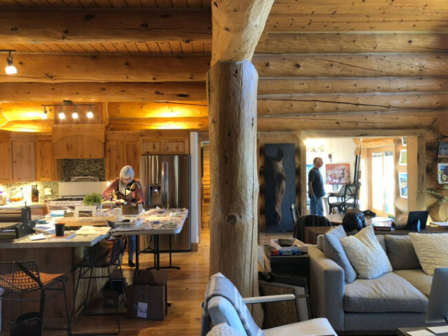
With lots of room to move, we set up our respective studios and were there two weeks, before having to get back home to travel again.
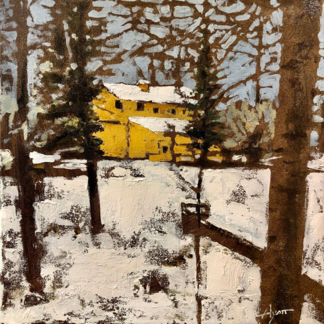
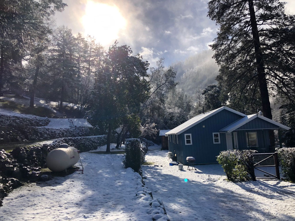
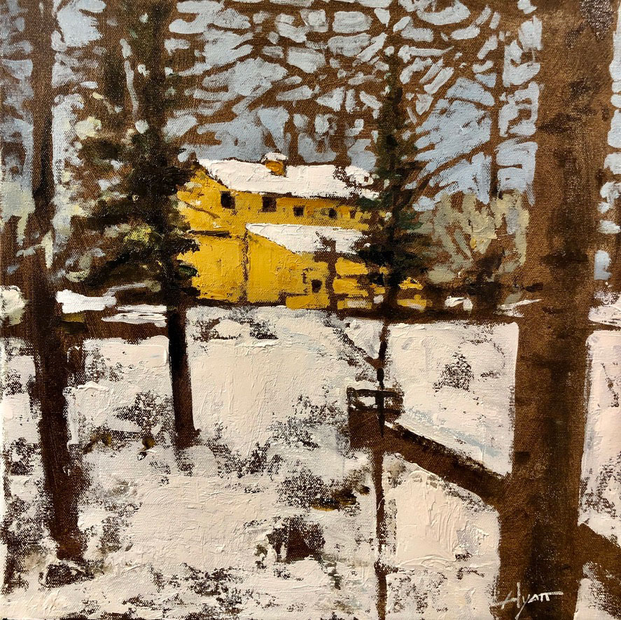
The owner of the “cabin” requested a painting of his barn. Here’s how it looked on Thanksgiving Day, a holiday we celebrated simply and by ourselves. Very lovely. (And cold.)
.
DECEMBER

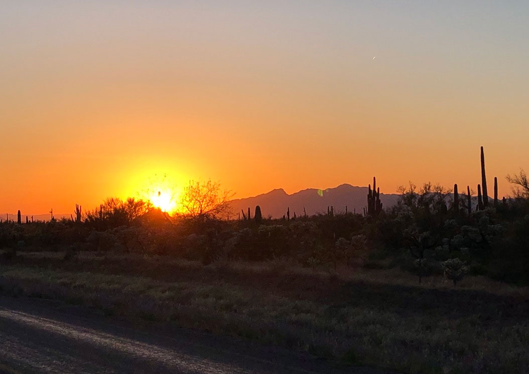
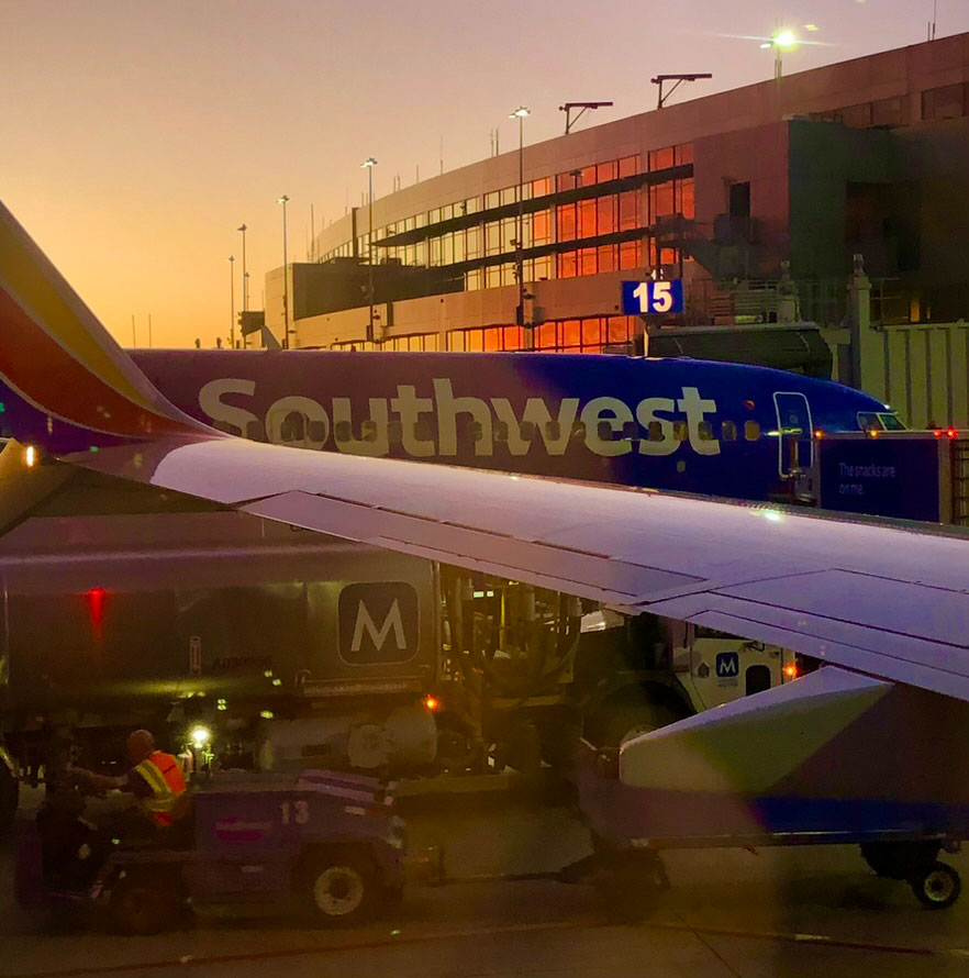
Almost as soon as we got home from Idaho we flew off to Florida again. Here’s a sunset stop-over in Austin.

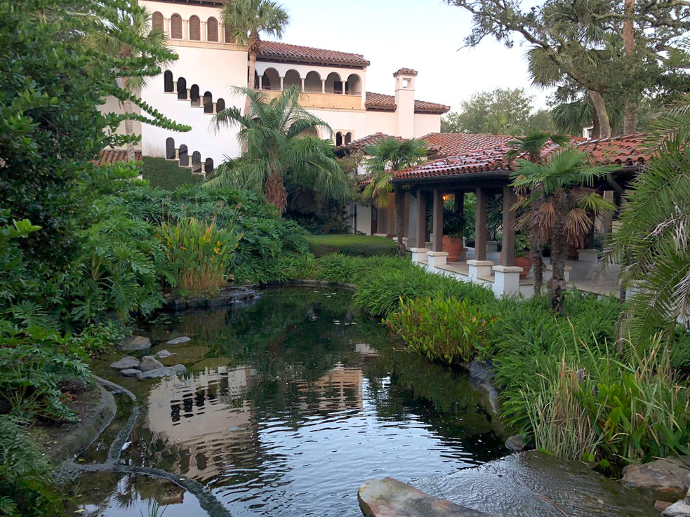
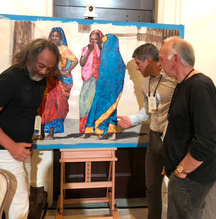
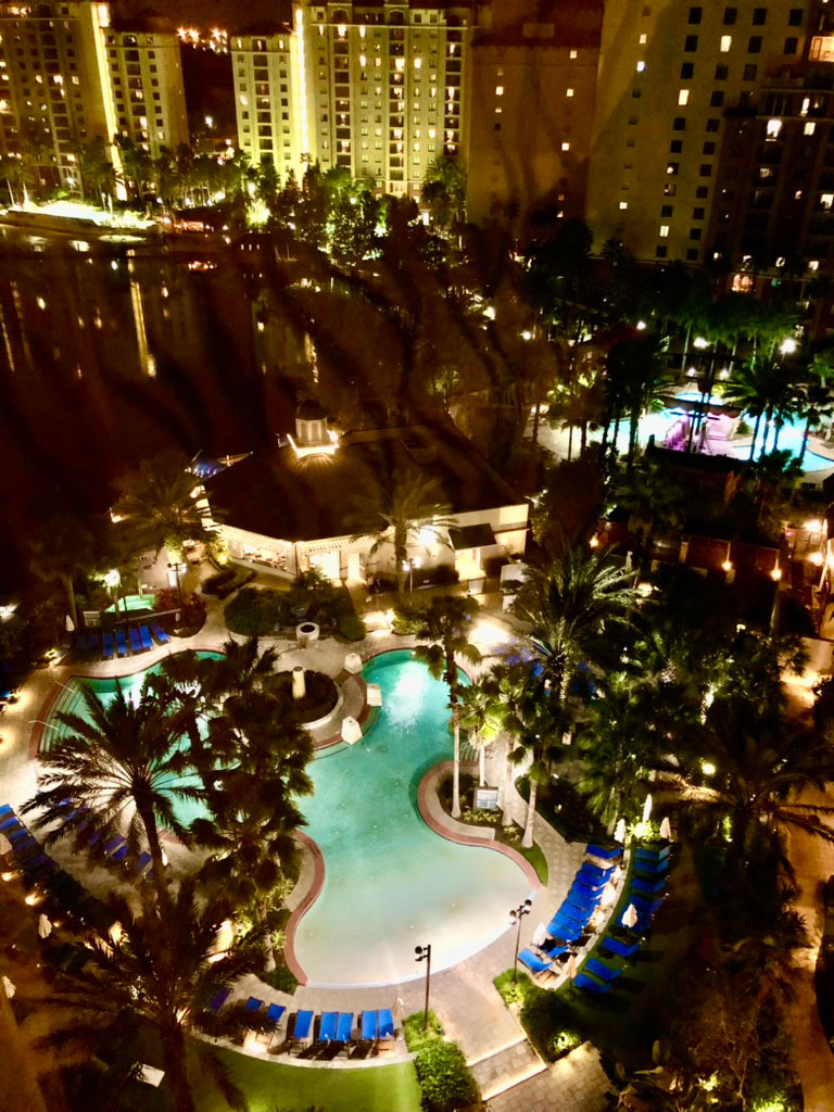
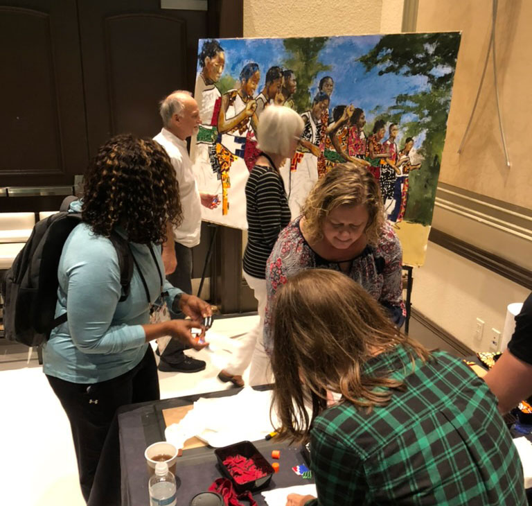
We were at the Wyndham in Orlando, along with staff of Seed Company, an organization I’ve painted for many times. We even worked with them for a couple of years way back.
Being for a different organization, we used the African Dancers motif again, and again applied it with African fabrics glued to the painting. It’ll hang in the Arlington, Texas headquarters, along with a dozen or more other of my paintings . . . something they say they love, being surrounded by so much art.
DECEMBER (continued)

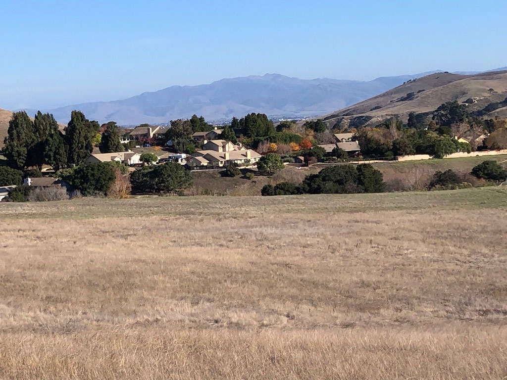
Finally, one more trip, this a day’s drive to northern California to be with family for Christmas. Here’s their neighborhood outside Salinas. Besides the family time we enjoyed walks in those hills, good for exercise or, when alone, good contemplation.

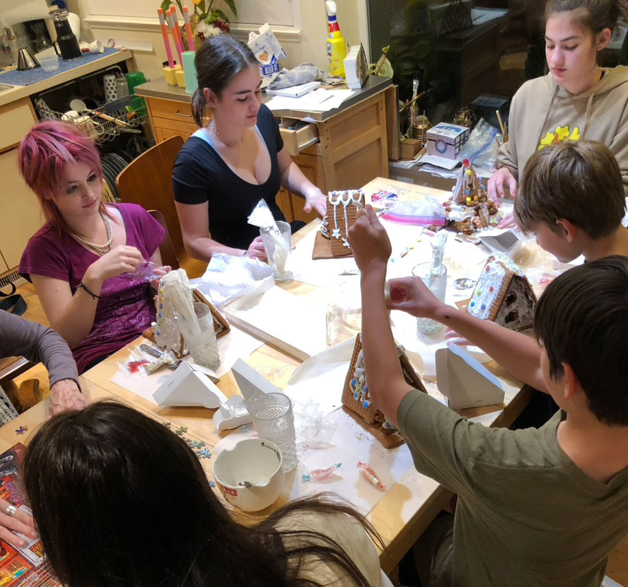
Grandchildren making ginger bread houses.
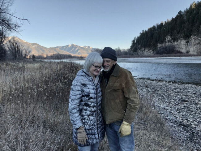
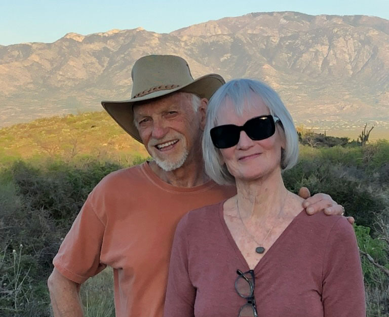
One more, Anne and me on a stroll from the cabin over to the Snake River. Of all the places I’ve been this year, with her is always the best.
Thanks for reading.