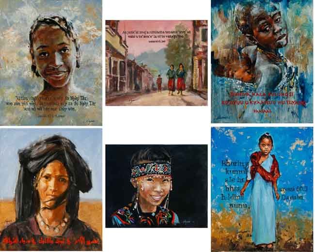
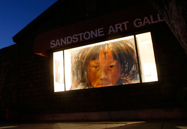
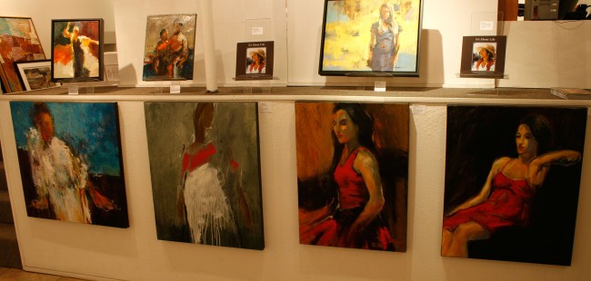
Once again this year we were invited to participate in a grand event to raise interest and funds for world literacy among minority languages. Among other things, I was commissioned to make six paintings.
This year the event was held at the beautiful Montage Resort in Laguna Beach. That was perfectly convenient for us as we live just ten minutes from there. Because of that I was able to transport and show some 45 pieces of art, all to enhance the ambiance and theme over the three days of the event. That’s besides the six new ones shown here.
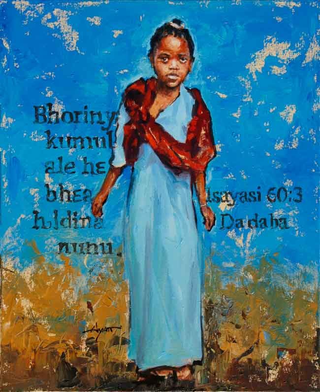
Ethiopia Blue, 24×20, oil. A child of the Dadaba language group.
Illuminations, the name of the event, has become its own entity, hosting an association of organizations involved in the same work. Thus, the paintings were ultimately presented as gifts to the various organizations.
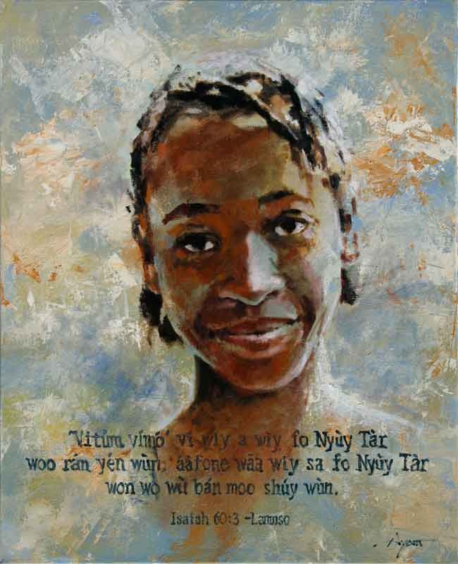
Cameroon Braids, 24×20, oil. A speaker of the Lamnso language.
It’s primarily Biblical illiteracy that these groups come together to address. The approach, in large measure, is to find and support educated members of these minority languages for the sake of translation in their own languages . . . of which there are still a great many without even a written alphabet.
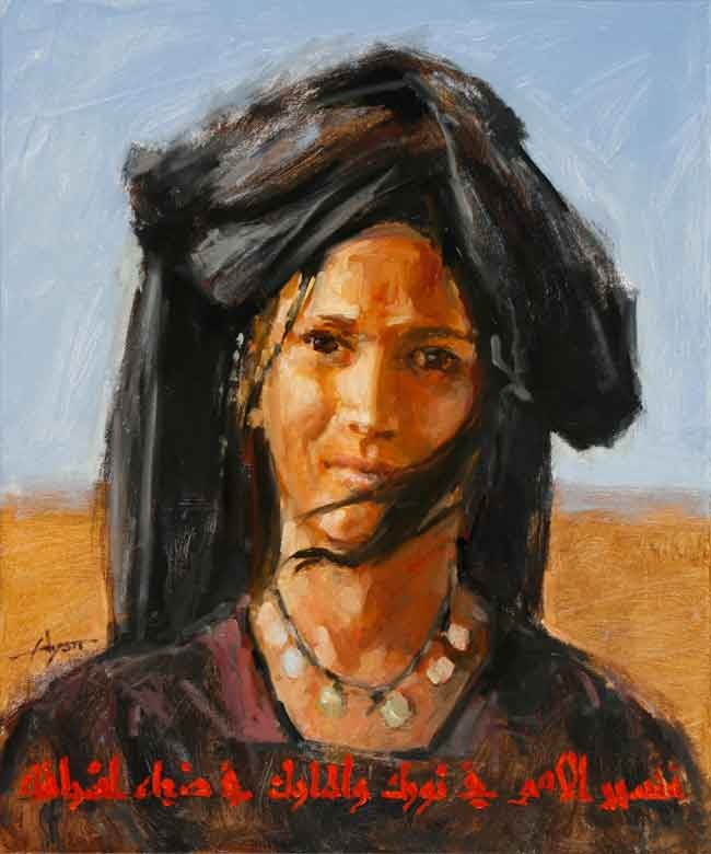
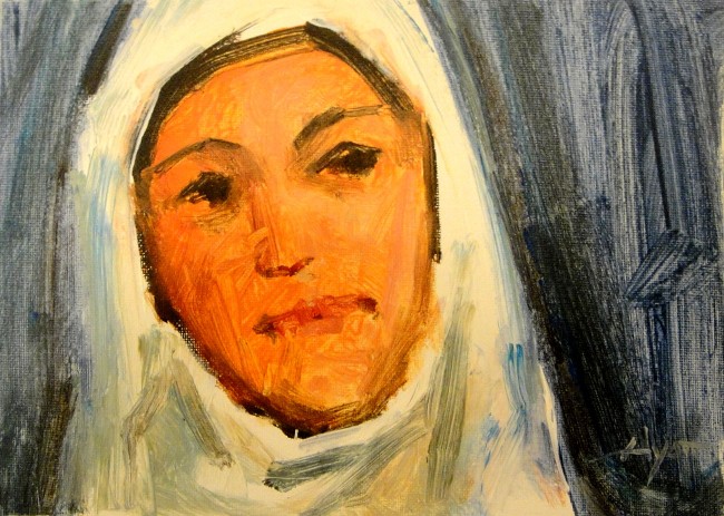
Egyptian Girl, 24×20, oil, here with Judeo-Christian scripture in Arabic. (Why not?)
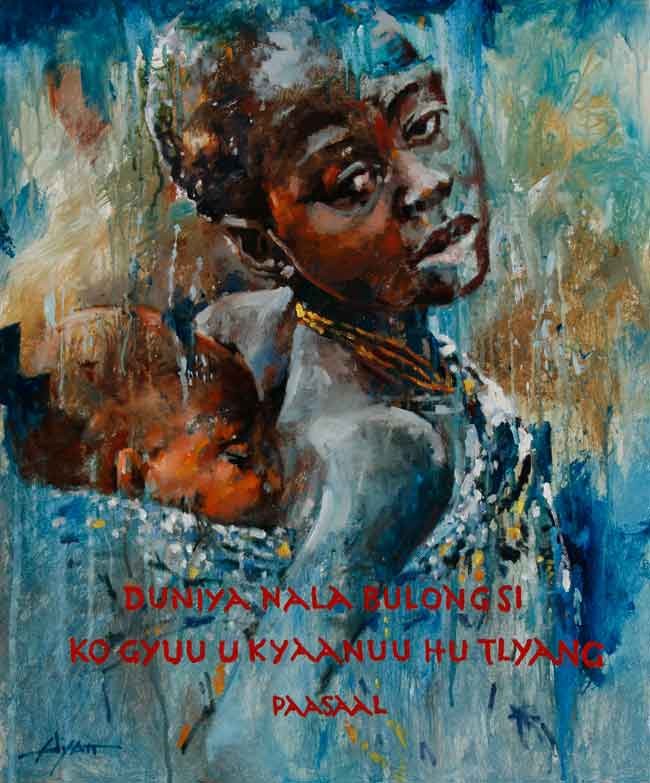
In all cases I was asked to incorporate a sample of the language spoken by the people represented, all of which are being written for the first time. An exception to that, however, is this young woman representing the deaf in Egypt, of which there are a great many, with the text in long-existing Arabic.
Ghana Siblings, 24×20, oil. People of the Paasaal language.
You’ll note a variety of slightly differing styles on these, if nothing else, to keep my own interest up. When I first started painting it was images from these populations I focused on. When galleries wanted other subjects, I broadened. Now I paint everything, and in many styles, but I do like returning to these special subjects, people of the earth.
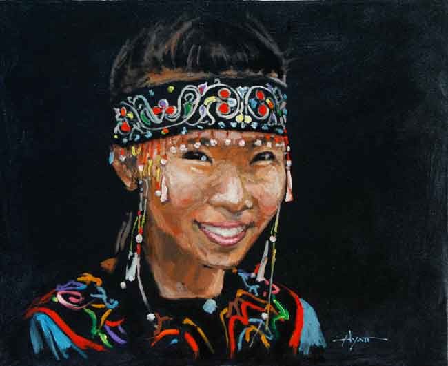
Siberian Princess, 24×20, oil. A study in strong color coming out of black.
An exception to the theme of incorporating text in the paintings is this one where there is no written alphabet developed yet. This smiling beauty is a child of the reindeer herders of Siberia. Their culture is abundant with these curly and colorful designs, each of which carries meaning that they understand.
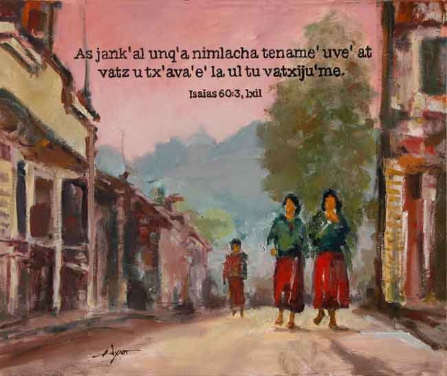
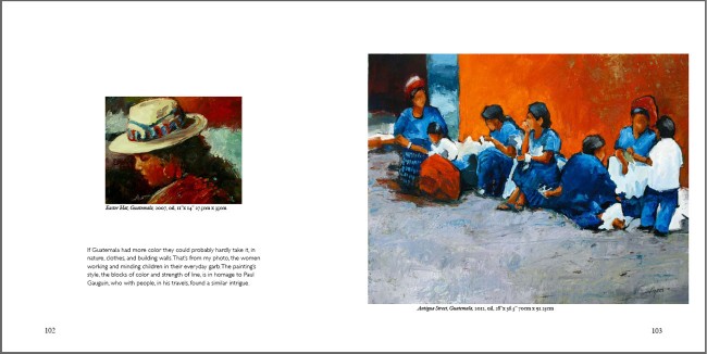
Guatemala Street, 20×24, oil. A town in the Ixil language highlands.
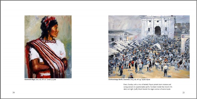
By the time I got to this one, I decided on a town-scape. The Guatemalan people are particularly interesting to paint, what with their colorful clothes, and I’ve painted many in the past . . . even lived there for two years (though before I was painting). By the way, in each of these paintings the quote is from the Biblical book of Isaiah, “Nations will come to your light.”
In the end, the paintings were framed and presented, and now hang as reminders of the event and the collaboration in various offices around the U.S. and in England.
We’re grateful.
_____________
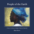
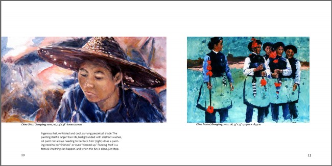
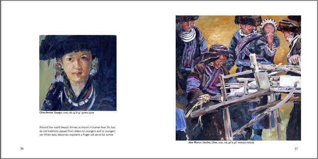
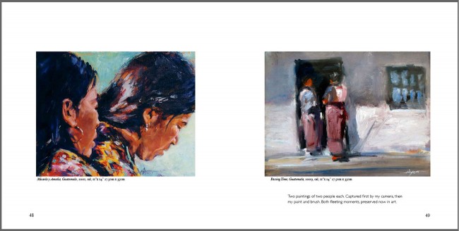
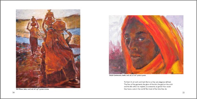
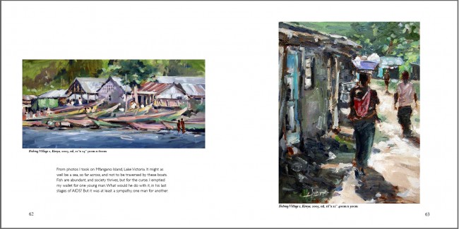
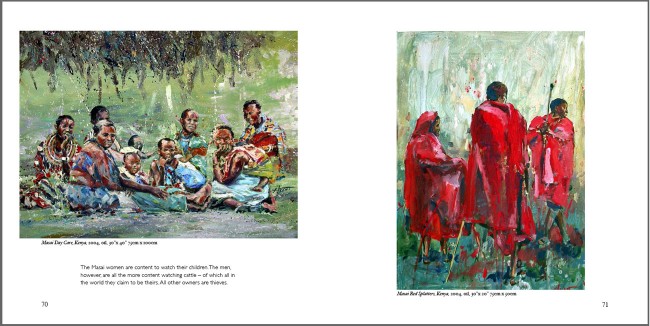
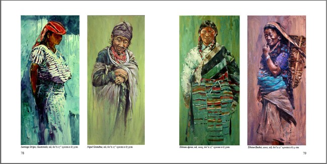
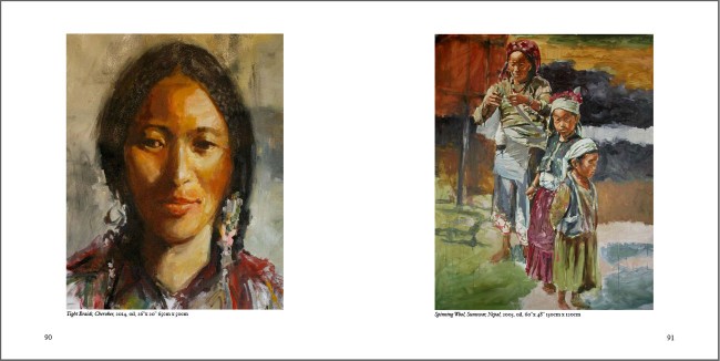
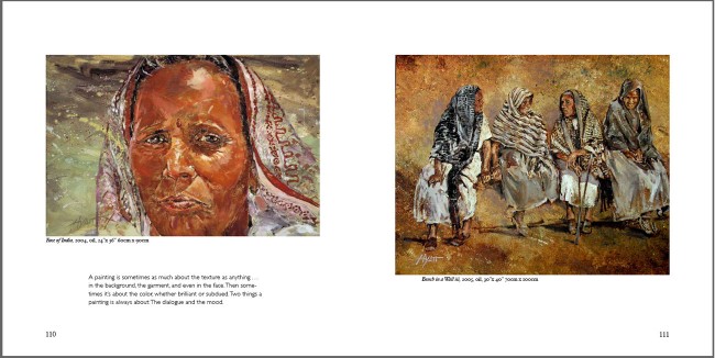
While on the subject, let me remind you of the new book, People of the Earth, a retrospective and catalogue of my paintings in this genre. It’s a beautiful little book, mainly because these people are so beautiful. Great for a coffee table, great for a gift. Order through this website (I can sign it for you if you’d like) or through Amazon. Click here for this site.
